Best practices, tips & guidelines in web design that you should know
What are the best practices in web design? How do you implement them successfully in your next web design project? And what do we define as design standards and best practices in web design?
What do we mean by best practices?
In web development, there are fixed rules that primarily have to do with the readability and cleanliness of the code as well as the security of a website. In web design, on the other hand, the terminology is somewhat more vague and the rules are more open to interpretation.
Best Practices: Web design is more than aesthetics
Best practices in web design are a mixture of visual design, user experience design, accessibility and content writing – with a focus on SEO.
Best practices in web design are a set of rules to follow in order to meet the general expectations of users. They are also guidelines for more clarity and a better user experience.
In this article, I present the best practices for good web design. For each area, I will give you tips on how you can acquire further knowledge and present tools and examples that will help you with your next project.
I will also briefly cover the topic of best practices in WordPress development. As you probably know, project planning and project management are an important part of web design. In this article, I will leave both topics out for the time being, as this would go beyond the scope of this article.
Planning WordPress projects: From requirements to implementation
We spoke with Ben Hutchison-Bird from NINE Brackets about key strategies for translating client needs into successful WordPress and WooCommerce projects.
We are now starting with the established standards for visual design: What are the best practices in the field of visual design? And which factors are included?
Recognition feature and branding
The website must match the rest of the company’s image and should be based on the style guide. Therefore, check the website for the following questions:
Can you recognise at first glance which company the website was created for?
Has the style guide been integrated?
Can the website operator be recognised by the visual elements?
Are the visual elements used consistently?
Does the language used on the website reflect the branding?
Google is way ahead when it comes to consistent branding. I can’t think of any other brand that has so many different products and still manages to give each product a corporate feel. Even when I look at a previously unknown Google product, I can associate it directly with the brand.
How does Google manage this?
Among other things, through the consistent use of Google colours, typography, striking whitespace, consistent call-to-actions and navigation. The logos also have a certain consistency that works across companies and categories – although the latter does not necessarily mean that the design is also popular.
With consistency in branding, you first analyse whether the website optimally reflects the company and its branding.
New: Raidboxes AI Site Assistant
With the new Raidboxes AI Site Assistant, you can create your website in just a few steps – without any technical stress. Whether it’s a business website, store or portfolio: You enter your prompt and the AI delivers the design, structure and content. Test the new AI Site Assistant now!
Another “best practice” is defined by the integration of standards. These include, for example, placing the logo in the top left-hand corner, the appearance of buttons, links and so on. These help visitors to your site to find their way around quickly and easily. These standards are therefore indispensable for the realisation of successful usability.
Further resources on the topic of usability
Why should you, as a web designer, be particularly interested in usability and user experience? You can find more extensive approaches to the topic of usability in this article.
We define widespread design standards in web design through UI design patterns. Andy Crestodina explains very clearly how standards are defined in his article on web design standards.
According to this, a design approach must be used on at least 80 per cent of websites to count as standard. Anything else is either a habit (50-79 per cent) or even brings inconsistency and confusion (0-49 per cent) to your website.
Harmonious design: the rule of thirds
I have already reported on the topic of harmonious web design. This time I would like to go into a little more detail about the rule of thirds.
This has been used for several hundred years – mainly in the visual arts and later in photography. As shown in the drawing, the design is divided into 9 equally sized boxes:
When creating websites, the rule of thirds also helps you to place the most important information in such a way that the visitor can perceive it directly.
Put simply, a visual element should not take up more than three boxes and should be located in a third of the layout. The nodes are also particularly suitable for placing important messages and calls to action.
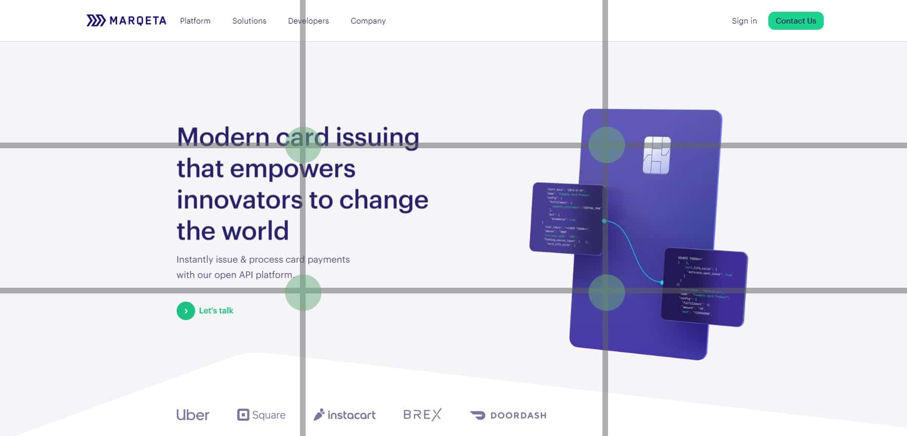
In Photoshop, you can use the “Crop Tool” and the “Rule of Thirds” setting to quickly and easily check and adjust your layouts. To illustrate the rule of thirds, I took a closer look at the Marqeta website:
The product and its message are well distributed across the nodes. The design could be made a little more efficient here by moving the CTA slightly. However, the harmony of the design would suffer somewhat as a result:
The mobile version clearly shows that the message fills the lower third of the layout, while the product is displayed fairly centred. We could rethink the placement of the CTA here.
So-called “heatmaps” also help you to find out where visitors to your site mainly look and click. The Crazy Egg tool, for example, offers a (paid) service here.
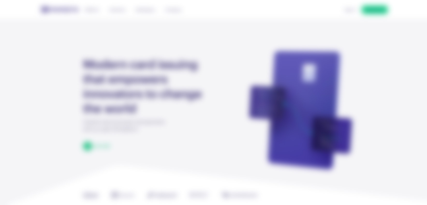
Another way to check your design is the so-called blur test. This involves taking the sharpness out of your layout (for example using Photoshop and the “Gaussian Blur” – 12 per cent). If users can no longer read the content, it quickly becomes clear where the focus falls when viewing the website. This test is also well suited to analysing the CTA.Is it still recognisable as such?
I used the Marqeta website again for this. The CTA on the right and the product are particularly prominent, followed by the message and finally the logo and the second CTA:
I have further toned down the mobile version to test what remains. Here, the product catches the eye first, followed by the CTA and the logo. You can carry out this test with the entire page – ideally during the design phase. Here you can quickly and easily analyse which elements of your design are prominent and decide whether this is what you want.
Optimise content and SEO
The creation of websites naturally also includes written content. There are professional copywriters who – with an eye on SEO, usability and style guide – write meaningful content for your website. However, there are also a few guidelines that you can follow yourself.
You should pay particular attention to the length and readability of the text – texts are often too long and too convoluted.
Content marketing for advanced users: The 6 most important levers
Discover how to optimize your content marketing to reach the right audience, build trust, and achieve long-term success.
Even if the target group is used to a certain amount of technical jargon, you should always be aware that our attention span on a website is much shorter than when reading specialised articles, for example. Rather, we are looking for specific information when browsing websites. We scan the content, so to speak, rather than actually taking the time to read it properly.
Google also gives you minus points if the sentences on your page are too long and plus points if they are connected by so-called “transition words“.
Interesting articles on the topic of SEO are also available:
Web accessibility is unfortunately still a marginal topic – and is too often ignored. Here, too, there are simple approaches that we could consider from the very first design. For example, do you mainly use colours to highlight information?
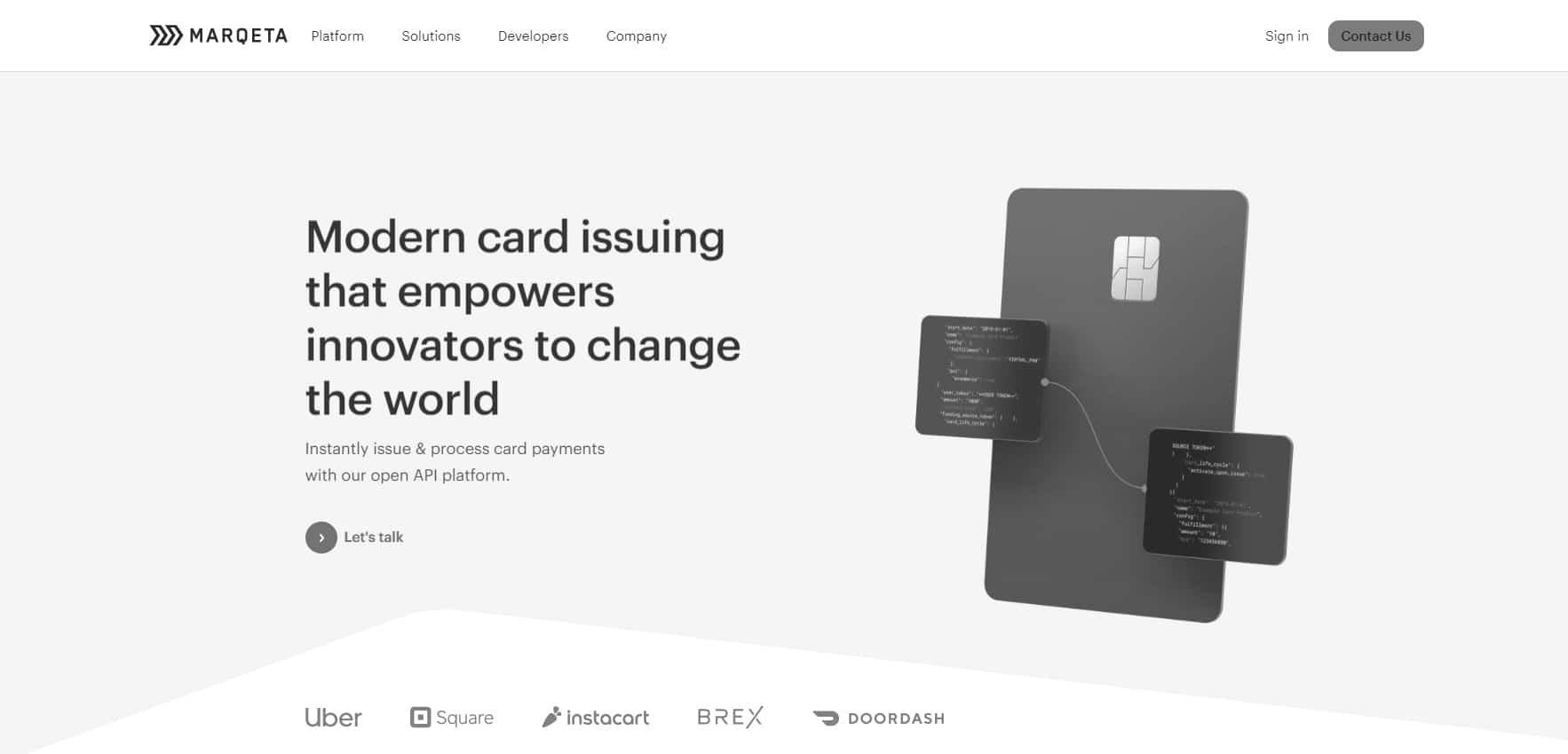
You can easily test this by taking a look at your website in black and white:
I analysed the same website again. Even without colours, the message comes across clearly. The top right CTA could be problematic in terms of contrast.
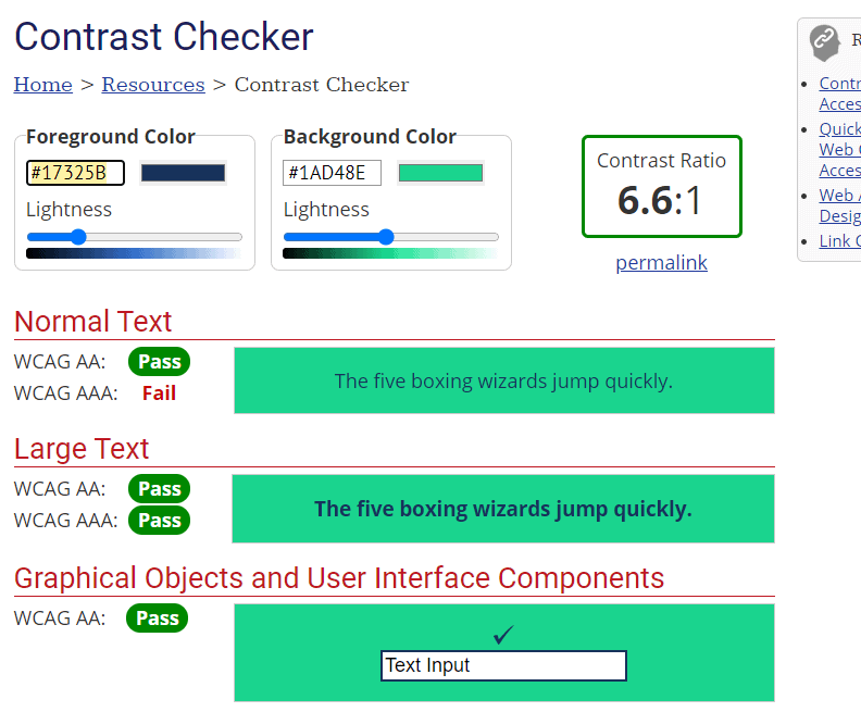
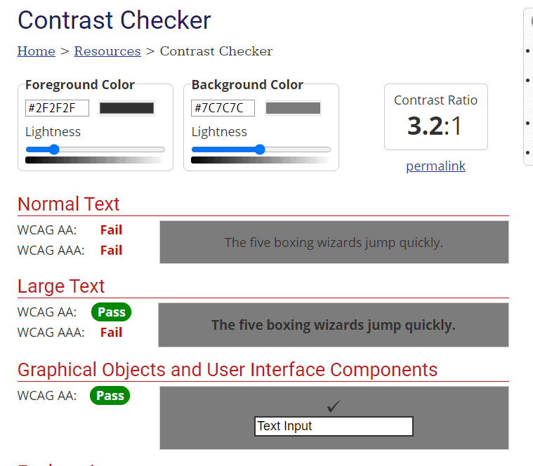
To check this with certainty, there is the “Contrast Checker”. The default contrast ratio is at least 4.5:1 for normal text and 3:1 for large text such as headlines:
If I specify the grey tones, the CTA is not contrasty enough, but sufficient in the colour version.
http://colorsafe.co/ is another tool for determining colours and their contrast. Here you can try out different colour combinations directly. The ratio is given to you directly and you have the option of selecting fonts and which WCAG standard you want to align your selection with.
The use of colours for the visual representation of error handling can cause problems. Take form elements, for example. Errors are often displayed here by highlighting the input box in colour. For someone with a colour weakness, this can lead to errors not being recognised and therefore not being resolved.
You should take this into account when planning and therefore always make sure that there is another representation of the error. Here you can find more interesting facts and resources on the topic of accessibility, as well as valuable tips for creating an accessible WordPress website.
We share the latest WordPress insights, business tips, and more with you once a month.
"*" indicates required fields
Resolution and responsive web design
There is probably no rule in web design that is mentioned more often – and disregarded more often – than “mobile first“.
With this approach, the content is created for mobile devices and then adapted accordingly for the larger devices. The opposite of this is to orientate the design towards desktop and other devices and then adapt it accordingly for smaller devices.
Two other approaches come to mind:
Create a separate website for each mobile and desktop device and then access it accordingly.
Display the website as a desktop version on the mobile phone
The former can – depending on the project – be the right approach, but is not very widespread as it is very costly and time-consuming. The latter is unfortunately still seen too often on the web and therefore urgently needs to be added to the list of “best practices”. You can find more tips on mobile optimisation here.
Mobile first does not necessarily always have to be the right approach: Studies on the target group and their internet behaviour can quickly show you which devices are mainly accessing your site.
The idea behind this is not only to prepare content visually, but above all to take into account the changed external conditions. You can read more about this in the article Mobile-First UX Design Is No Longer a Trend.
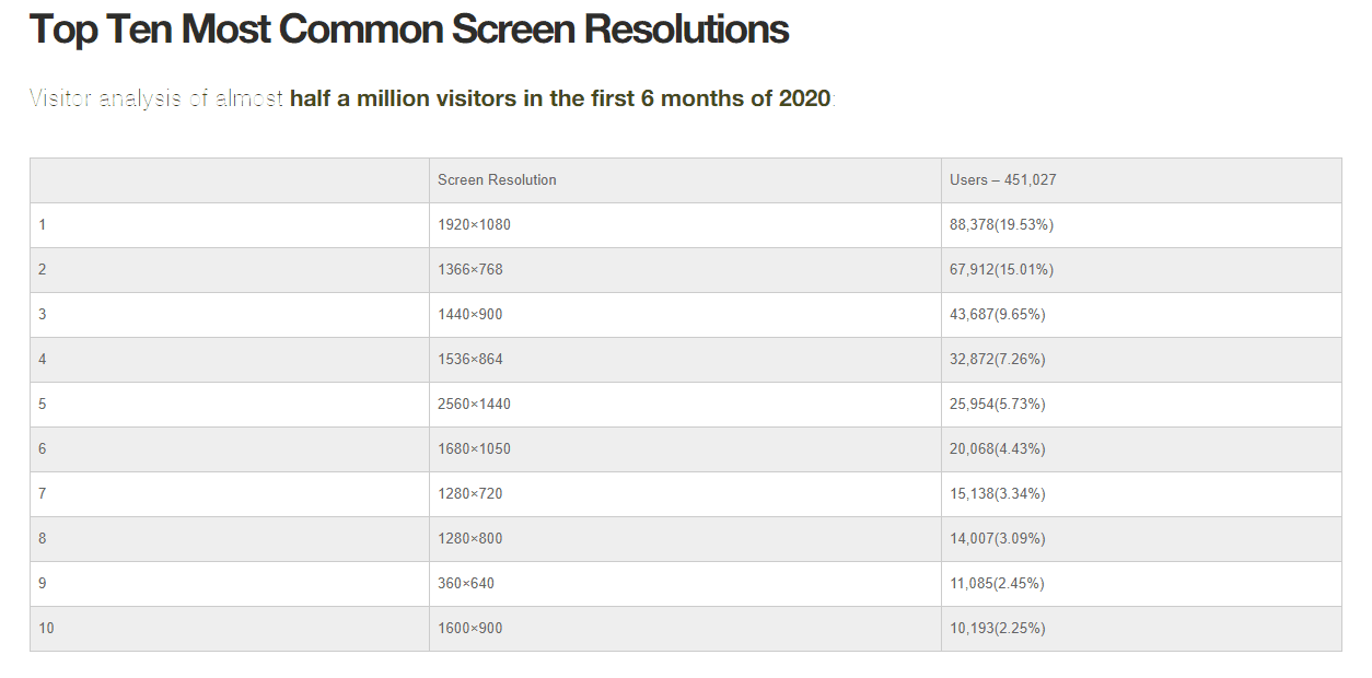
The table below clearly shows which screens are used more frequently to access the internet. This can help you decide which screens you want to optimise your website for. However, please note that such a generalisation can only be used as a guideline. These statistics are no substitute for analysing your target groups.
WordPress offers you an incredible number of options for presenting your designs on the web. However, there are also standards and best practices that you should follow.
The WordPress Codex
WordPress provides a general codex for this, which can help you to learn more about the topic.
WordPress plugins and themes
When choosing the right plugin and theme, it is not just its current functionality that is important. It is also a good idea to read reviews and familiarise yourself with how often updates have been offered and to find out whether the plugin or theme will continue to be developed in the future. WordPress tools that are regularly developed further usually have more active support. They are also more likely to remain compatible with future versions of your site.
WordPress updates and security
Updating your themes and plugins regularly reduces vulnerability to unauthorised access. Bugs are resolved and your websites are adapted to the ever-changing technical environment. Security plugins such as WordFence also help to keep an overview of your site and its security and to react to problems in good time. An SSL certificate should be integrated into every website.
Your questions about best practices in web design
What questions do you have for Sonja? What best practices can you recommend? Feel free to use the comment function. For more insights on WordPress, web design or online business, follow Raidboxes on Facebook or LinkedIn – or subscribe to our newsletter.
After studying game design and creative writing in green Auckland, Sonja Hoffmann specialised in web and app design and development. She focuses on gamification and exploring user motivation and experience, coupled with a passion and curiosity for technological trends.


Leave a Reply