User experience (UX) design, usability, human interface design and human-centred design – these are just some of the terms we are increasingly confronted with. But what are they actually? Why should you be particularly interested in usability and user experience as a web designer? And how can you achieve added value through UX even if you don’t have a UX designer on your team?
In my last article on harmonious web design, I showed you how to create your own design guidelines. However, harmonious web design is characterised by several factors – so today I’m going to introduce you to the user experience:
Why bother with UX design?
Many German designers I know have a strong background in communication design – so they come from a print media background. They create sophisticated compositions that present a precise message.
In print design, the communication channel is clear: there is a sender (e.g. a poster or brochure) and a recipient (the person at whom the medium is aimed). The recipient has nothing more to do than receive and understand the message and then make a (purchasing) decision.
Web design, on the other hand, is interactive: not only is a message sent, but a conversation is created.
User experience: the user experience
Since the early days of the internet, companies have been dealing with the psychological aspects of these interactions. However, back then, people didn’t talk about UX designers, but about human interaction designers – and the profession was generally much less widespread than it is today.
What is user experience?
According to today’s standards, user experience does not begin when a user visits a website and does not end when they leave it. Rather, it describes the entire experience that a user has with the brand or product – from the first to the last contact.
However, I would like to limit myself to the area that is directly related to a website: usability. The path through our product should therefore be as pleasant and seamless as possible. However, you should not ignore the budget and internal company requirements.
Good usability can have a significant impact on your sales figures. What drives me personally is my duty as a website operator not to frustrate the user.
Affordances, signifiers and feedback
Simply put, affordance describes what is generally possible. Using the example of a desktop screen, this would be the ability to “click”. As it would be pointless and frustrating if you had to click randomly everywhere on the website, we build in signifiers (indicators). These show the user where something is possible and what.
One of the best-known signifiers is a button. It delimits the interaction area. We know that if we click here, something will happen. This is usually reinforced by hover effects – or when the cursor turns into an index finger when I hover over it. These are also signifiers.
What are affordances, signifiers and feedback?
Affordance describes which interaction is generally possible. Signifiers (indicators) signal that an interaction is possible. Feedback, on the other hand, ensures that the user knows that their interaction has triggered something.
The active-state of the button shows me as feedback that something happened when I clicked on it. All three processes are interlinked and can help you to make your website more user-friendly from the outset.
- What interactions are generally possible?
- How do I show my users that they are possible?
- How do they know that they have done the “right” thing?
The possibility of interaction is often defined by the device used to access the website: Swiping and touching is not possible on a (standard) desktop computer, while there is no hover effect on mobile devices.
This is exactly what needs to be taken into account when choosing signifiers. For example, do links only become clear when I hover over them with the mouse? Then a mobile visitor will not recognise that interaction is possible at all.
Upselling, cross-selling & measuring success
Discover how to effectively measure and boost cross-selling opportunities with actionable strategies tailored for agencies and freelancers on the Raidboxes blog.
Users interact physically and digitally
However, affordances and signifiers can also go beyond your website interface. Your visitor can be influenced by external circumstances or use certain interactions differently than originally intended. The browser’s back button, for example, is a circumstance that is external to your website.
If the visitor has accidentally navigated to a part of your site where they can’t find what they’re looking for, there’s a good chance they’ll navigate using the back button instead of the links on your site.
How interactions are deliberately used “incorrectly” – an example
I often book flights via a foreign service provider whose website is not displayed in German or English by default. I was suddenly unable to find the language settings via the mobile version. However, I remembered that I had previously accessed the website via the app, where everything was displayed in English by default. Since then, I’ve only accessed the mobile website via the “app” diversions because I can remember that and because I’d rather make two more clicks than click around frustratedly on a mobile site.
However, you should also be aware that you cannot “re-educate” your users. You can’t get them out of the habit of such “wrong” behaviour, but you can plan for it and also ensure that there are enough alternatives.
Another good example that has caused headaches for all of us is the – unfortunately still widespread – use of outdated browsers or Internet Explorer. Some layouts are not displayed as creatively valuable as in Firefox or Chrome, for example. Even if this is annoying, we have to design and programme for these users as well.
Because worse than accessing the site via the app, for example, or using the back button, is when the site visitor gives up completely – whether because using our site causes too much frustration or because there are too few alternatives to error handling.
Why usability testing?
Incidentally, the best way to find out about such behaviour is through observation. Who tests the website is relatively unimportant. You don’t necessarily have to find people who actually use the site afterwards. Because really gross usability errors occur with almost every user.
It is important that you do not tell the tester what to do or where to go. The key is to recognise and note possible obstacles and complications in order to make your website more user-friendly. The less you tell the test person, the more unbiased the result.
The 4 different indicators
What signals can you use on your site to emphasise interactions? We differentiate between four different categories, which I will briefly introduce to you.
1. explicit signifier
Explicit signifiers consist of a request in text form, such as “Click here”. These are often found in conjunction with other indicators, such as contact forms or buttons. These should be as clear and concise as possible. For the sake of simplicity, you should also use familiar wording and avoid supposedly creative formulations.
The recognition value enables the user to know with a high degree of certainty what result to expect from an interaction.
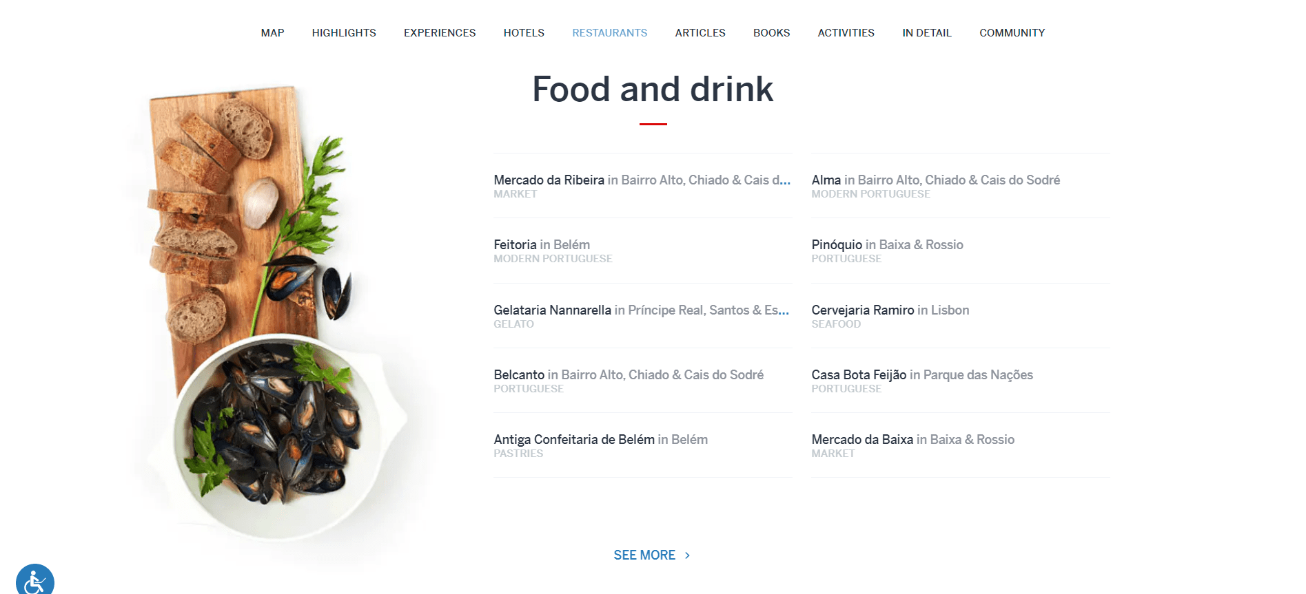
“SEE MORE” is an example of a simple explicit signifier.

2. design patterns: patterns and conventions
Design patterns refer to recurring designs that we have become so accustomed to that they no longer require any explanation or further reference. There are relatively many of them.
For example, everyone will know that clicking on the logo takes you back to the index page. Or that blue underlined text represents a link. The navigation bar on a website – as we use it today – is another such phenomenon. We expect them to appear in certain places on a page. We know that the nav bar serves as a summary of the content and guides us through the website. A menu bar that turns into a hamburger icon on mobile devices needs no further explanation.
Common patterns that we have learnt over the last few years
The surprising thing is that these patterns often have international validity. You can see this particularly well if you want to find your way around a site whose language you don’t speak. It is therefore worthwhile not to reinvent the wheel here. Instead, it is advisable to familiarise yourself with the established patterns to improve the usability of your site.
This is easily recognisable using the example of a page of a (randomly selected) restaurant in Moscow. Although I neither speak Russian nor can I read Cyrillic, I can immediately see how to navigate through the page. I can see which navigation point I am in and I am able to filter out the most important information (contact) straight away.
3. hidden signifiers
These can only be seen after a certain action, such as hovering and scrolling.
Hidden signifiers have the advantage that they make the layout look clean and tidy. They can therefore make your design leaner.
However, they also have some disadvantages. They are only found by the user if they either know that they are there or if they accidentally carry out the triggering interaction. This is why these signals are not suitable for important, but at most for secondary calls to action.
Planning WordPress projects: From requirements to implementation
We spoke with Ben Hutchison-Bird from NINE Brackets about key strategies for translating client needs into successful WordPress and WooCommerce projects.
When using hidden signifiers, you should also bear in mind that a separate solution may need to be found for each end device.
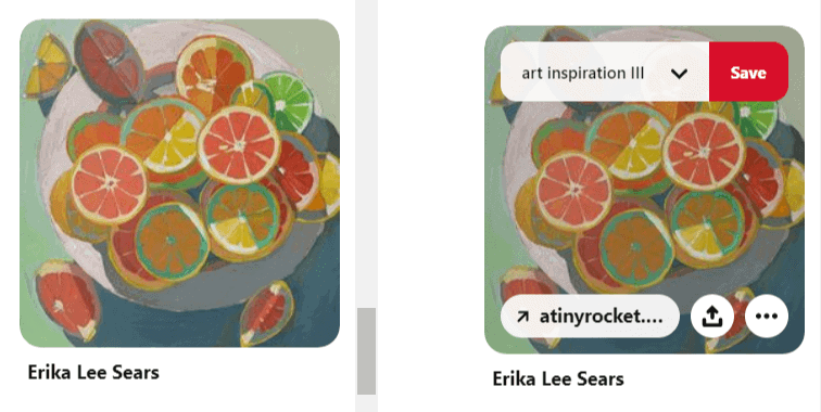
Pinterest is a good example of this:

In the desktop version, new calls to action appear when hovering. As the user intuitively clicks on the image to add it to their collection, the feature is highly unlikely to go undetected. Nevertheless, the designers have developed a plan B: Clicking on the image takes you to a large view in which all possible interactions are visible.
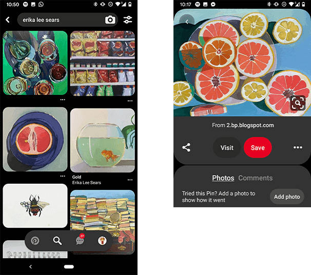
It is interesting to see how the whole thing is solved in the touch screen version. There are also hidden interactions here – but for other purposes.

The left-hand image shows the general overview of the page. The menu at the bottom only retracts when the user scrolls upwards – which seems unusual at first, but is also very intuitive. If we are looking for the navigation, we usually scroll upwards.
However, the additional call to action – as with the desktop version – is only available once you have actually clicked on the image. They are therefore no longer hidden signifiers.
However, I was surprised that Pinterest uses two different icons for the same interaction in the two versions. From a usability perspective, I don’t think this is advisable. If the user switches from the mobile to the desktop version, or vice versa, using the same icons would make it easier to find your way around. This makes use smoother. Usability is positively enhanced as a result.
4. metaphorical signifiers
A magnifying glass signalling that the search field is located here. The envelope that represents the sending of messages. The button that signals that you can press it. What all these principles have in common is that we recognise them from the real world.
Their use in the digital world has developed into a design pattern. However, you need to be careful here: If you use a metaphorical indicator with a modified symbol, this could confuse your users.
If you use a letterbox instead of the familiar envelope, for example, this could harm the usability of your website. Why is that? The user has to pause and think about the next step. They have to question whether this symbol matches what they want to achieve.

Conclusion on UX Design & Web Usability
Usability doesn’t just mean that your visitors somehow find their way through the site. Rather, usability means that the focus is placed on the visitor as a whole – the “journey” through your site should be as seamless as possible.
Every interruption – i.e. every time the user has to pause and ask themselves “What is actually being offered here? What happens when I click on it? Will I come back again? Where am I located? How did I get here?” – is counterproductive.
Is it possible to build a page in such a way that there is no interruption? Very probably not. Depending on the information presented, certain interruptions, targeted reflection and slight frustration may even be desirable.
It is important to know the different tools so that you can use them appropriately for your own project.
Recommended reading
One of the best-known books on usability is “Don’t make me think!” by Steve Krug. The title says it all and is ultimately what every usability approach is all about.
- “Don’t Make Me Think: A Common Sense Approach to Web Usability” by Steve Krug
- “The Design of Everyday Things” by Donald A. Norman
- UX Pin offers interesting e-books for free download
Your questions about user experience
What questions do you have about web usability and user experience design? Which processes can you recommend? Feel free to use the comment function. For more insights on WordPress, web design or online business, follow Raidboxes on Facebook or LinkedIn – or subscribe to our newsletter.newsletter.


Leave a Reply