User experience is all about causality: how do you know which events have which consequences? In addition to user testing and the use of design patterns, UX laws also provide you with answers to your questions. Used correctly, you will improve the usability of your website in the long term and invite website visitors to linger.
UX laws – or rules of user experience design – are intended to help you better understand how your designs are understood by end users. These rules often have a psychological approach. However, their origins can come from all areas of science. They are often simplified modifications of their original theories. It is therefore important that we look at where they actually come from and what they actually mean.
Jakob’s Law
People who use your website spend a higher percentage of their time on other websites than on yours. That’s why users expect your website to work just like all the others. This rule was established by Jakob Nielsen. You can find an explanation of this theory on YouTube.
In everything we do, we use our ability to learn something. In the area of websites, these are certain processes that we follow in order to achieve something specific. How many attempts we need to learn can be determined with the help of user testing and visualised as a learning curve.
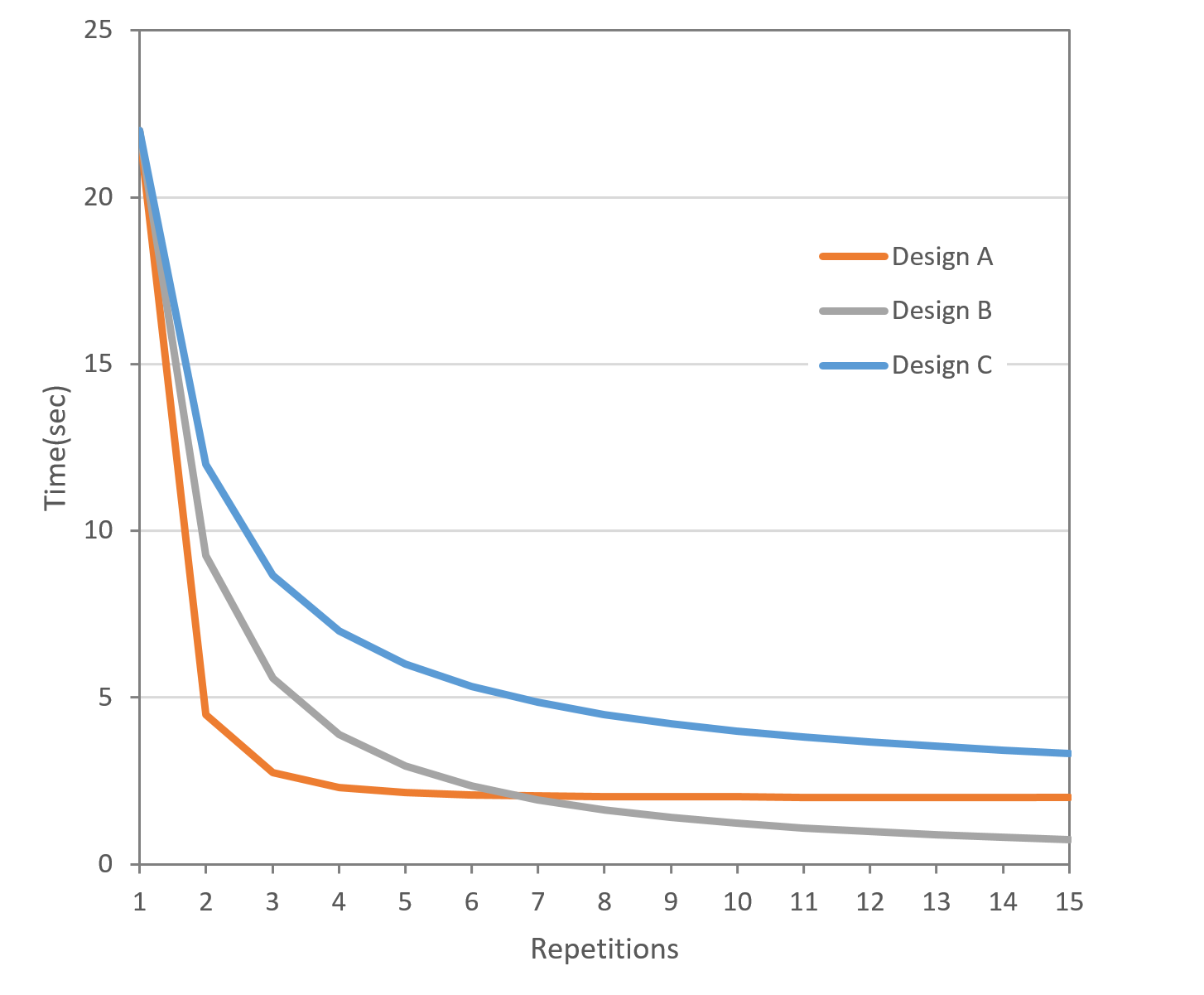
The learning process for general processes can take place not only on your website, but on all websites in parallel. As a result, users learn much faster and can navigate the web more quickly. We call these recurring patterns design patterns. You can and should use these patterns to design the functions of your website.
Unfortunately, Jakob’s Law is also often understood to mean that innovative design has negative effects. After all, the aim is to present a website that your target group can understand and use without much effort.
Innovation and moments of surprise are also reasons why a website is memorable. It therefore makes sense to base the functional aspects of your website on design patterns. Creative ideas and moments of surprise can then be used as visual aspects. For example, animations, micro-interactions and a sophisticated choice of colours can be used here.
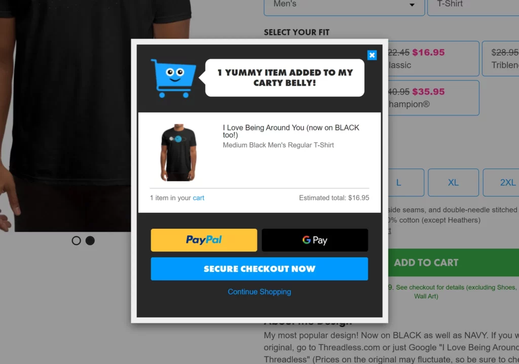
The Threadless team lightens up the design with an animation. This appears when someone places something in the shopping basket. As the animation is triggered by an action that users should repeat regularly, gamification also comes into play here.
Miller’s Law
Our short-term memory can remember about seven things.
This thesis was named after George A. Miller and his publication “The Magical Number Seven, Plus or Minus Two”. According to this theory, we are only able to memorise five to nine things in our short-term memory. These can be words, numbers or a sequence of characters, known as chunks.
You’ve probably heard of the trick of bundling numbers into packets to help you memorise them faster. You can memorise 568 741 896 256 faster than 568741896256.
Some scientists doubt this theory and claim that we can only cache four elements. When creating websites, the opinion has therefore sometimes developed that menus should only have a maximum of four or seven items. It is probably pointless to adhere doggedly to this rule.
The menu serves as a table of contents for your website. Visitors use it to navigate through everything your website has to offer. Artificially narrowing the navigation only has the consequence of making content harder to find.
Instead, you should build your navigation in width rather than depth. This means: as few levels as possible (but as many levels as necessary). You should take into account that users will find it more difficult to find their way around if you have several levels and use other indicators, such as breadcrumbs.

How to start a corporate influencer program
Turning employees into corporate influencers is a powerful way to boost brand trust and reach – learn how to start your own program and who to follow for inspiration.
Hick’s Law
The more choices a person has, the longer it takes to make a decision. This can even lead to an inability to make a decision.
The American psychologists Edmund Hick and Ray Hyman are responsible for this thesis. Hick’s Law is therefore also known as Hick-Hyman Law. They researched the correlation between the number of choices given and the time it took test subjects to make a decision.
As with Miller’s Law, it is recognised that our brain has a limited capacity of available “working memory”. If this capacity is exhausted, there is a high probability that a task will be cancelled.
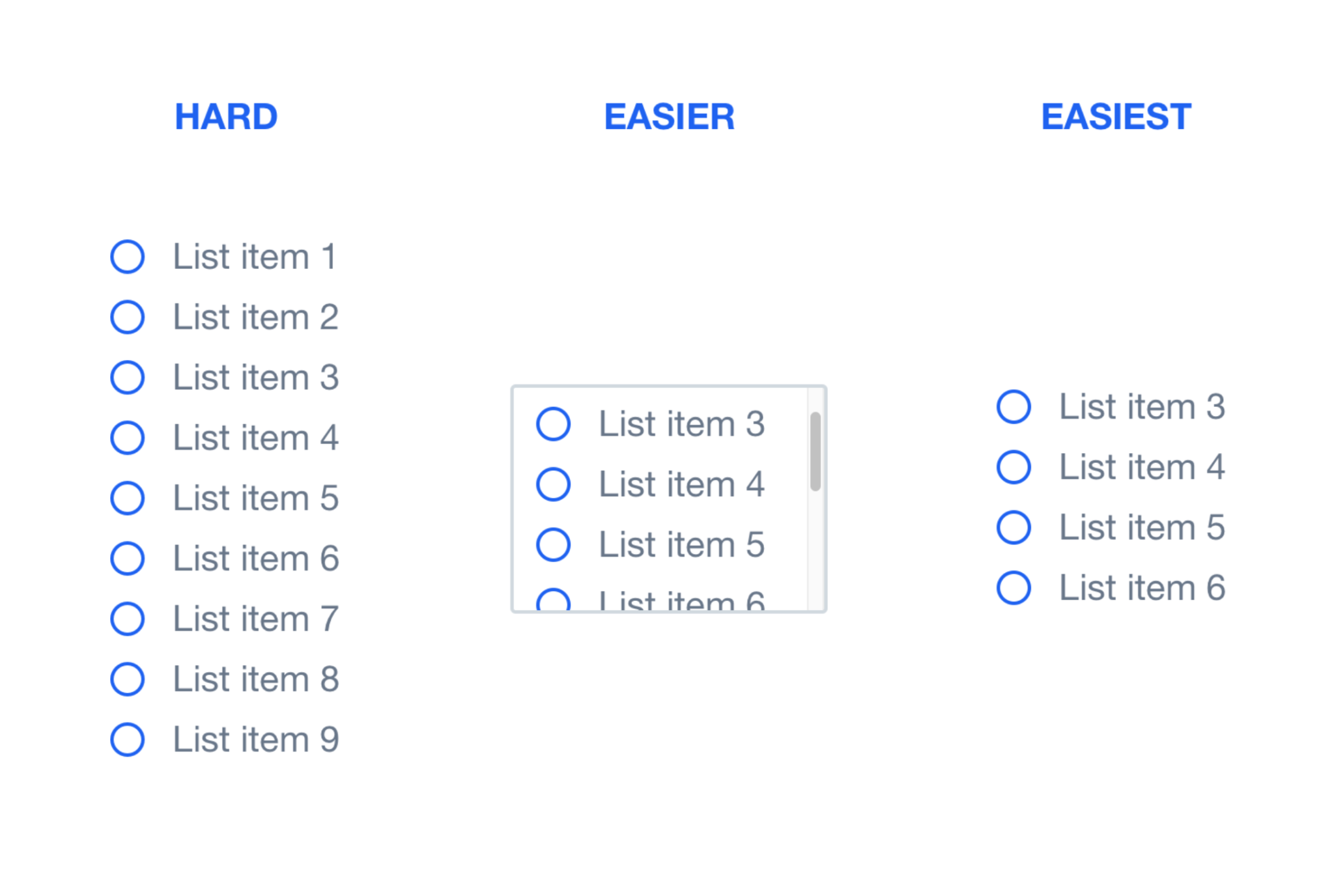
So instead of arranging all your products on one page, it makes sense to make a small selection. The best way to process this selection is to divide it into categories. Processes like forms should be served in smaller, more digestible bites.
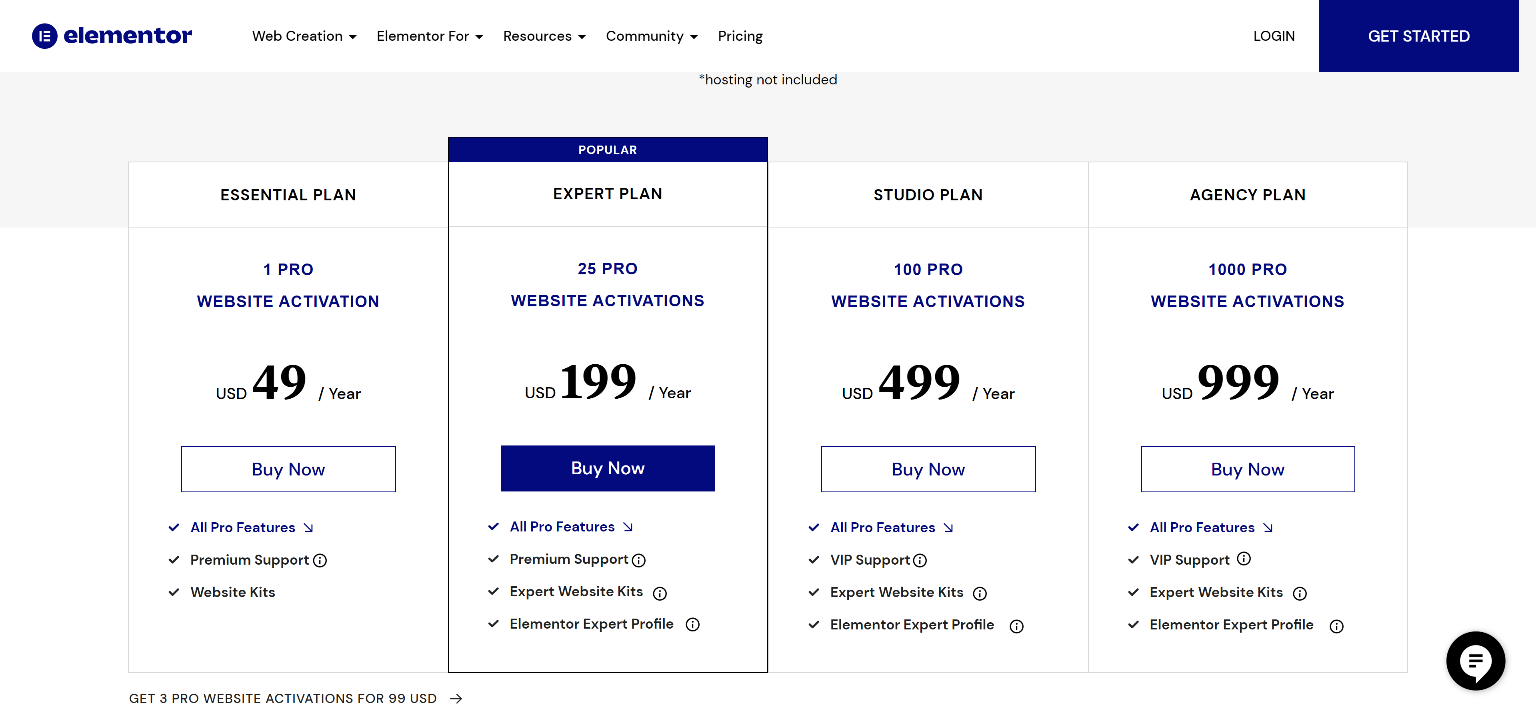
The number of products that are compared should also be kept to a minimum. You will usually find three to four price categories on most websites. Pre-selecting, as with Elementor, can also help the user to make a decision more quickly.
Parkinson’s Law
All available time is used to complete a task.
In 1955, Cyril Northcote Parkinson published an essay in which he described the following concept. The more time we have for a task, the more time we will spend completing it. Originally, his assumption was aimed at the ever-growing bureaucracy and companies. However, you can apply this rule to many aspects. The closer we get to a deadline, the more productive we become. The more time we have, the more likely we are to procrastinate.
With the help of Miller’s and Hick’s Law, we are already aware that dividing processes into smaller sections makes our work easier. You can increase efficiency by specifying a time.
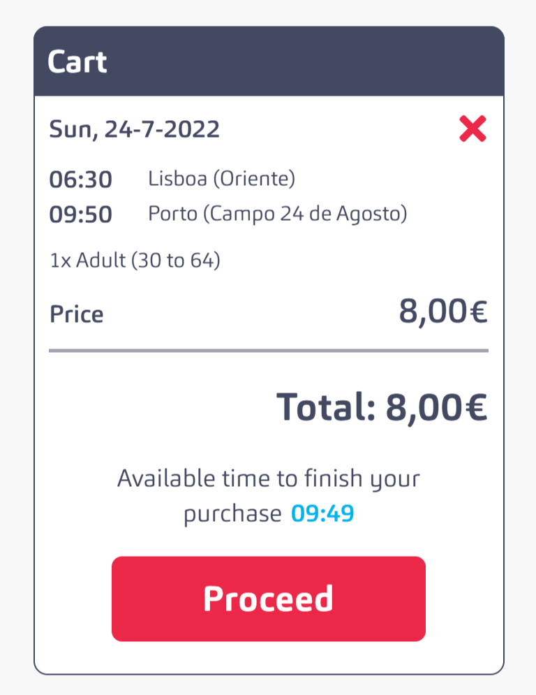
The Rede Expressos team will reserve a ticket for 10 minutes. You therefore have a limited amount of time to realise your purchase decision before you have to start a new search. On the one hand, this rule prevents someone from delaying the purchase and doing something else first. Under certain circumstances, however, this can also exert pressure – and lead to the checkout being cancelled. Online banking portals also often have a countdown. Although this was implemented more for security reasons, it ensures that we do everything we wanted to do on the bank website straight away and do not postpone individual tasks until later.
Fitts’ Law
The time required to reach a certain target can be determined by the distance and size of the target.
The psychologist Paul Morris Fitts published a paper in 1954 in which he published his experiments on the subject. In it, he explains that a movement can be divided into two phases:
- In the first phase, we move towards the target. This phase is mainly determined by the distance and is described as fast and rough.
- During the second phase, the movement slows down as we now aim at the actual target. The smaller the target, the longer this phase lasts.
This rule is preached again and again, especially when designing for mobile devices . The placement and size of a button directly influence the efficiency with which your website can be operated.
Links or buttons that are used frequently must therefore be clearly located in an area that is easy to reach. The size must be adapted for touchscreens. In addition, you should bear in mind that users still often miss-tap and therefore plan enough distance – especially to logout buttons.
But you should also apply this rule to desktop sizes. Although we have the option of clicking on smaller targets using the mousse, the screen itself is much larger and therefore the distance that can be travelled is also much greater.
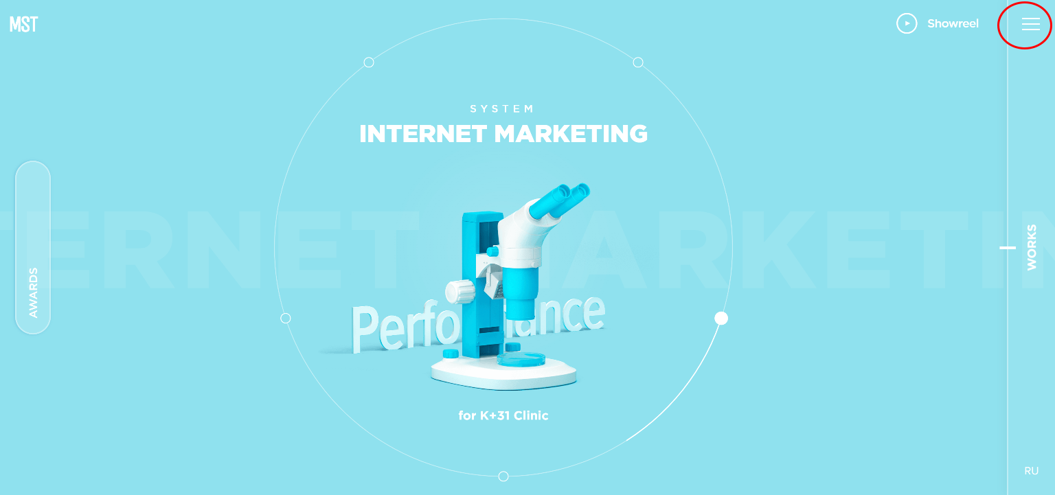
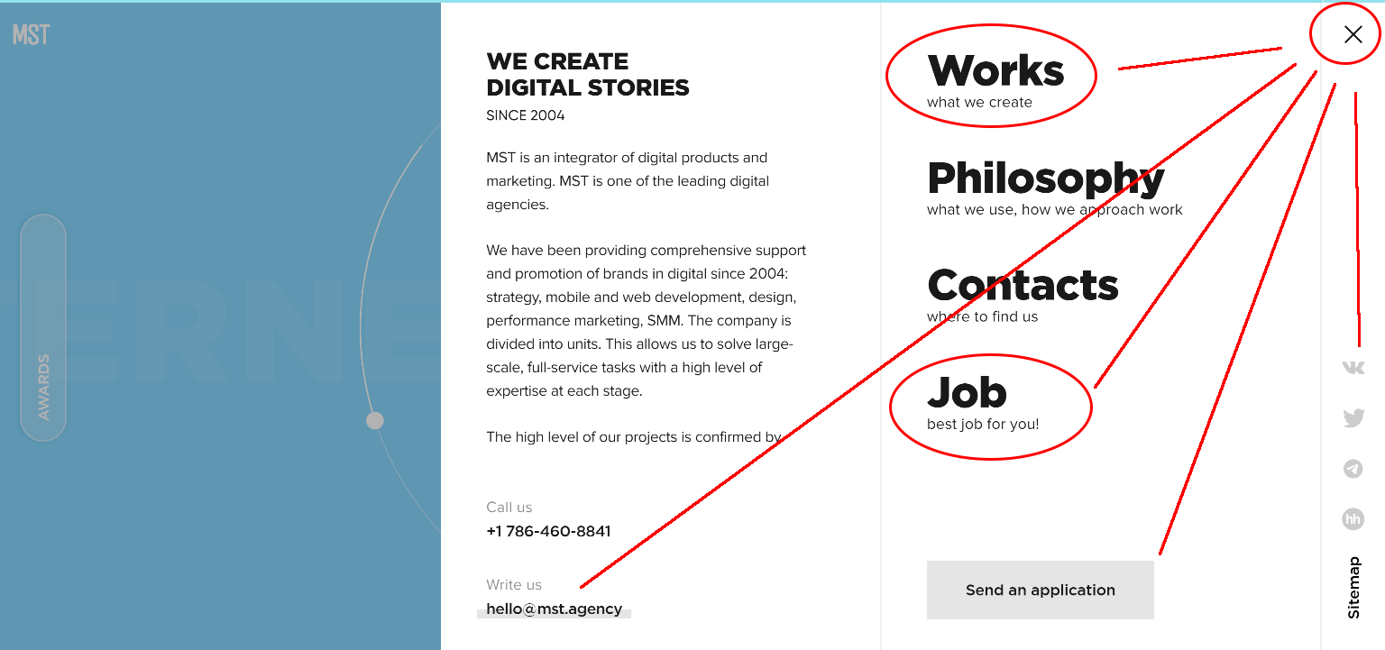
In the MST example, you can see Fitt’s Law in action. To open the menu, users must click on the icon in the top right-hand corner.
The navigation opens from the right with several possible interactions. To close the menu again, the pointer does not need to be moved at all. If you have clicked on it by mistake or out of curiosity, you can easily return to the previous screen.
The menu items that feel closest should be the ones that are clicked on the most. Those that are less important – such as the e-mail address – are furthest away. The fact that everything initially takes place on the right-hand screen also increases efficiency. After all, users are already on the right-hand website. The possible paths are therefore kept very short.
Conclusion on UX Laws
Now you know the most frequently cited rules for user experience. There are others such as Postel’s Law and Tesler’s Law. In the future, research will continue to do its best to analyse the motivation and influenceability of our behaviour. Designers often provide the interface between product and user. It is therefore essential that we also address this topic. It is particularly important that we use our knowledge for and not against the users.
Want to find out more about psychology in web design? Then take a look at the following resources:
- Laws of UX is a collection of best practices that you as a designer can take into account when designing user interfaces.
Do you have further questions?
We look forward to your comments and questions. For more insights on online marketing, WordPress and web design, follow Raidboxes on Facebook or LinkedIn – or subscribe to our newsletter.


Leave a Reply