

We remember colour theory in art class: the importance of the colour wheel, temperature and chroma. As a web designer, you work with colour theory on a daily basis – whether unconsciously or consciously. In this article, I’ll show you how to create good colour combinations for your next web project using the right principles and tools.
Colour theory: the order of colours
The first records of colour theory and the colour wheel date back to at least the beginning of the 17th century. The origin of colours, the reflection of light, the process in the human eye – all of this has occupied mankind for a long time.
We designers are often primarily visual types. Creating colour combinations often comes from the gut. We constantly see and analyse the colours around us. This results in an intuitive way of dealing with colours.
However, factual knowledge of colours and their effects is not only essential in order to be able to explain the choice and arrangement of colours. It is also important for making decisions that deviate from the norm.
In order to find the optimal colour combinations for your customers and websites, a sound knowledge of colour theory is essential.
As designers for digital surfaces, we have a decisive advantage over print media: how many colours you ultimately use and which tones you choose has no impact on the cost of the product. However, this only applies as long as your project remains digital.
You are also not subject to the technical limitations that we have with print media. As a designer, this gives you the wonderful freedom to develop your full potential.
Subscribe to the Raidboxes newsletter!
We share the latest WordPress insights, business tips, and more with you once a month.
"*" indicates required fields
Primary, secondary and tertiary colours
Our screens are generally based on RGB (Red, Green, Blue) – also known as the Additive Colour System. As a rule of thumb, you can say that everything that reflects light is based on the Additive Colour System. In this structure, we use the primary colours as a starting point. White is created by the combination of all colours, while black represents the absence of colours.
Explained using the example of a simple colour wheel: primary colours are yellow, red and blue. Secondary colours are created when you mix primary colours together. Tertiary colours are created from mixtures that contain primary and secondary colours.

Hues, tints, shades and chroma
Hues, or colour tone, describes the unmixed six primary and secondary colours:
- Tints describes the shade that is created when you add white to a colour.
- Shades uses the same principle as Tints – but here we mix in black.
- Chroma, also known as saturation or tone, is what we call the mixing of hues with grey or neutral colours such as white and black. If we follow this definition, then shades and tints also belong to chroma.
Temperature and contrast
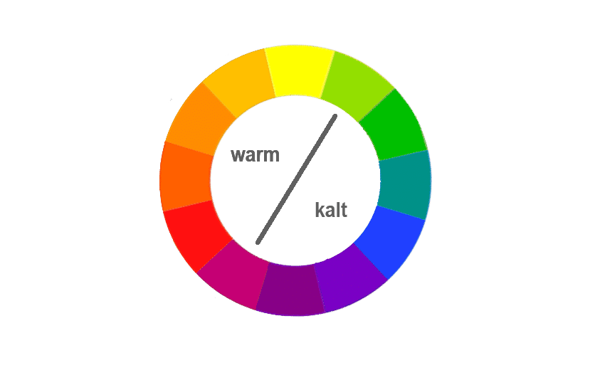
You can also classify the colours into temperatures. A few rules of thumb apply here:
Warm colours look more dominant when you pair them with cold colours.
This also allows you to convey a feeling of depth. Cold colours therefore appear further away than warm colours. Colours of intense warmth can also make cold colours appear even colder.
Grey and shades of grey, white and black belong to the group of neutral colours. Beige and brown are also often classified as neutral colours. However, I personally only partially agree with this, as a shade of grey can definitely appear warm or cold. I also tend to categorise beige and brown as warm tones. For me, neutral colours are defined as white and black and all shades of grey in between to which no other colour has been added.
WooCommerce Hosting
With WooCommerce hosting, you can launch your own online store quickly and securely and manage it professionally – without any technical hurdles. Check our Raidboxes WooCommerce Hosting now.
Neutral colours tend to look uninteresting on their own, which is why they need at least one colour to stand out.
Exceptions prove the rule here, as there are some minimalist black and white layouts that manage without any other colours. Brown and beige can also look very attractive as the dominant colour, e.g. in a monochromatic design.
Primary colours contrast with each other.
There is another way to create contrast. By looking at the colours that are about three squares apart on the colour wheel. These pairings can easily create disharmony. Because they clash. However, used correctly, for example as a call-to-action, they can give your design an interesting contrast.
8 principles for harmonious colour palettes
Complementary colours
Complementary colours are two colours that are directly opposite each other, are combined in this concept, as in the example of Youtube Culture & Trends Report.

Two complementary colours stand out from each other as much as possible. This creates a high-contrast yet harmonious colour scheme. These designs are suitable for dynamic, attention-grabbing designs. You should therefore make sure that this also reflects the product you want to communicate.
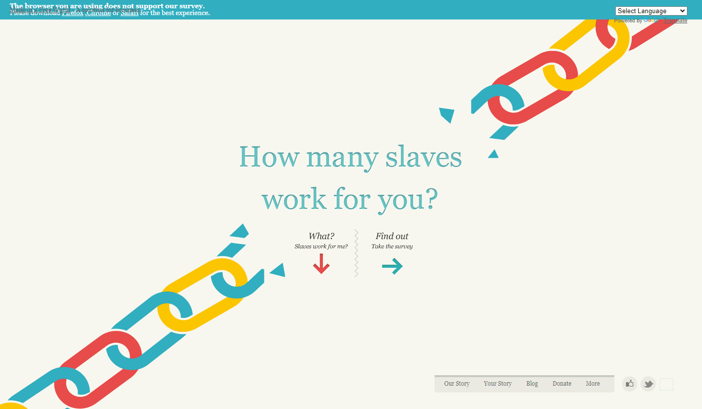
Triangle combination
The triangle combination describes three colours that are equidistant from each other on the colour wheel.
Similar to the previous combinations, this one is also quite simple and easy to use. It offers more diversity, but you are still on the safe side with it. The basic principle is that there is hardly any harmonious combination. These colour palettes are particularly suitable for websites that are intended to appeal to a wide range of users.
You should still choose a colour that dominates the design. This ensures a clear design and more harmony. This is also shown by the example of Slaveryfootprint.org.

Split complementary colours
Split complementary colours describe a similar concept to complementary colours. Here, only one side is split. Instead of the complementary primary colour, you now use the surrounding tertiary colours. This palette offers more possible combinations.
Adding a third colour to the complementary scheme adds a little more balance to the layout. This combination is used quite often on the web. However, the colour scheme does not have to be as loud as in this example.
The third colour is often used by designers as an accent colour and is used very sparingly. You can use this principle to give your websites a soft contrast.


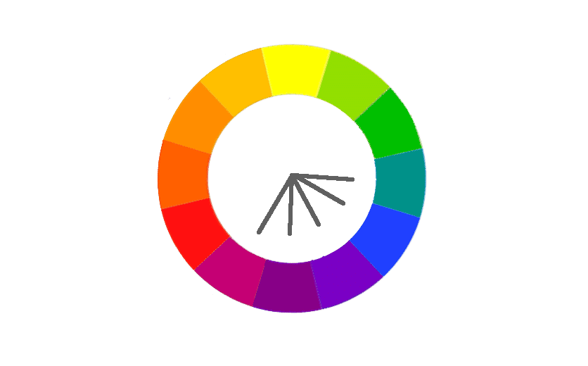
Square colour combination
Similar to the three-sided concept, the square colour combination combines four colours. Of all the combinations presented so far, this is the most difficult to master.
Here, too, we combine two pairs of complementary colours. However, sensitivity is required here when distributing the hierarchy. On this website, the red tone is used sparingly to prevent the red from dominating the other colours. Instead, a cold blue and a neutral beige have been used as dominant colours.
Content marketing for advanced users: The 6 most important levers
Discover how to optimize your content marketing to reach the right audience, build trust, and achieve long-term success.
When using this principle, you should ensure that warm and cold colours are used in harmony with each other.


Square split complementary colours
Consists of two adjacent colours and their complementary colours.
With these colours, you can create a colour palette that gives you the appealing contrast of complementary colours while being more diverse, as in this example.
Analogue
Analogue colour palettes are two or more colours that lie next to each other on the colour wheel. Analogue colour palettes are less rich in contrast than the previously described combinations, but still have the same effect.
It is a good idea to work out a hierarchy for your website and use the colours accordingly. In the example below, Crips Studios has chosen purple as its most dominant colour. This colour is then also the one that sets the mood on your website.

Monochrome
Monochrome describes different tones and/or chroma of the same colour. This is the simplest way to achieve a harmonious colour scheme. Used well, it can still make your site stand out from other sites.
The use of monochrome colours additionally enhances the emotional effect of the original colour and also creates elegance. Minimal designs benefit from monochrome colour palettes. You should also be aware that monochrome websites are low in contrast.

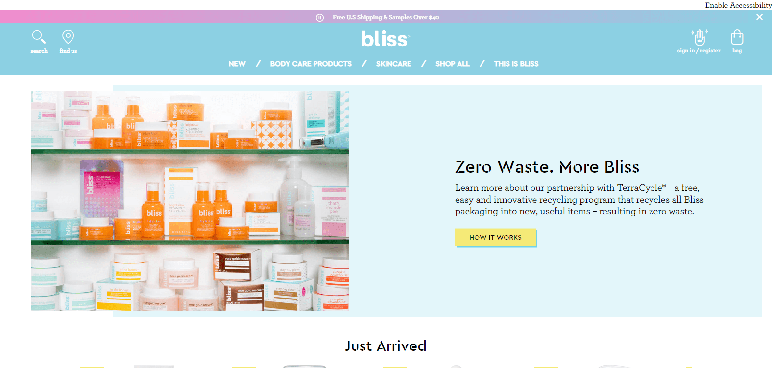
Chroma and tinting
The use of colours with similar chroma or tint values. In the example of Bliss, a harmony was created through the constant use of pastel colours.
Inspiration & tools for colour theory
By now it’s more of a classic and still one of my favourite tools for creating colour palettes: Adobe Colour Wheel.
As a new feature, you can also check your selection to see whether it is still displayed with sufficient contrast for users who suffer from colour blindness.
- Eggradients provides a range of inspiration for gradients and the matching CSS styles.
- Khroma is an AI-based browser application that learns which colours you particularly like and creates corresponding combinations. Definitely recommended as quick inspiration for colours and combinations.
- Coolors is a platform where you can find inspiration and put together your own colour palettes. It also offers extensions for Chrome and Adobe.
Colourco works in a similar way to Adobe Color Wheel. You can set the principle according to which your colour palette should be created. You can then test and create colour combinations by simply hovering. You can download your selection as a Sass stylesheet or .png.
Emotive Feels also offers you an attractively designed website for exploring different colours and their effects.
Your questions about color theory in web design
What is your experience with colors in web design? What questions do you have for Sonja? Let us know in the comments! For more insights on WordPress, web design or online business, follow Raidboxes on Facebook or LinkedIn – or subscribe to our newsletter.
Leave a Reply