A suitable font not only makes your website much more visually interesting. Fonts have a decisive influence on whether sections of text are ignored or read. In this article, I’ll show you how to find the perfect font for your website!
Good typography is the result of years of familiarising yourself with fonts and design. However, a few basic tips can help you to train your eye accordingly and use the right font for your web project.
Best practices, tips and guidelines in web design
Web design is more than just aesthetics. At least as important are: a good UX, accessibility and SEO. In this article, I’ll show you the best practices for successful websites and satisfied users.
The very first website …
Or: What happens if you load a website without CSS. In the past, websites were displayed in the fonts that were integrated in the respective operating system. These are still loaded today if the font cannot be accessed. The very first website is still online today and looks exactly as it did when it went live in December 1990:
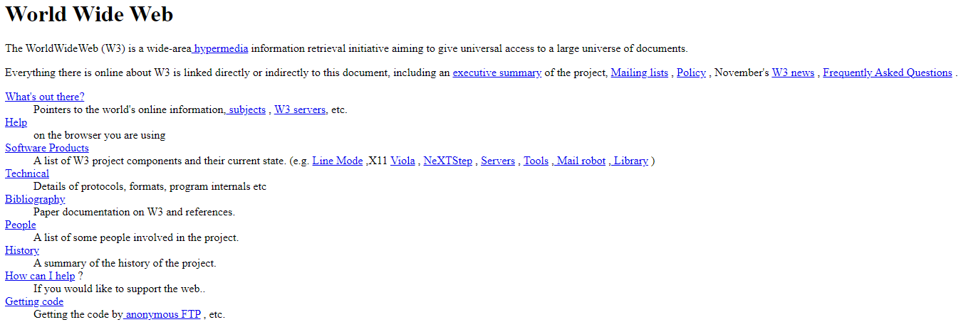
How the website is displayed in your browser does not depend on the website – but on the operating system you are using. And whether you have made any changes to the default settings.
For Windows users, serif fonts are displayed in Times New Roman by default. On Mac OS X, however, it is Times or Times Roman. Arial is used by Windows as a Sans Serif font. Mac OS X uses Helvetica here.
Zach Leatherman has developed a project in which he has tested various operating systems and the associated fonts. The Font Family tool gives you an interesting insight into the fallback fonts – and what they look like in the end.
Content marketing for advanced users: The 6 most important levers
Discover how to optimize your content marketing to reach the right audience, build trust, and achieve long-term success.
Georgia and Verdana
In the mid-1990s, the standard fonts were finally joined by Georgia and Verdana, which were specially designed for the web by Matthew Carter. Building good websites with a meagre selection of five fonts gave rise to a nowadays questionable habit out of necessity: Fonts that were not usually available on the web were incorporated as image files.
The disadvantages of this are obvious:
- The appropriate display on different devices can degenerate into painstaking detail work.
- The words cannot be discovered or translated using the search function.
- What’s more, every text change represents an enormous amount of extra work.
Designing for the Unknown
Fortunately, the technology has matured much further in the meantime. Nevertheless, a fundamental knowledge of the technical area is also necessary here. Because it is important to understand what happens on your website if the desired font is not available. There can be various reasons for this. For example, a poor internet connection that causes your CSS file to load with a delay.
In contrast to graphic design, the following applies to the web: bad (unsuitable) fonts are better than no fonts at all.
While you are considering which font best supports your site visually, it is also important to ask basic technical questions:
- Is your text displayed even if the CSS file is not loaded?
- Is your page still readable in Standard Serif and Sans Serif?
- Do you provide an alternative font? How is it displayed? Can you make any other settings that give you more control over your fallback fonts?
First and foremost, it is important that the content is displayed at all. General legibility is the be-all and end-all when choosing the typeface.
Robin Rendle provides interesting basics on the subject of FOUT vs. FOIT (when the font is loaded) in his article Loading Web Fonts with the Web Font Loader.
Further information on this topic can be found here:
- https://www.filamentgroup.com/lab/font-events.html
- https://css-tricks.com/almanac/properties/f/font-size-adjust/
Where does your font actually come from?
Now that you have familiarised yourself with the technical background and fallback fonts, one very important aspect remains. Namely, where your font is actually loaded from. As previously mentioned, every operating system has its own standard fonts. In addition, every user can install fonts on their computer. So it is impossible to know which ones are available – or not.
In order to display our websites in more than just Arial and Times New Roman, we are increasingly turning to web-based font services. The advantage is obvious: the restrictions we have when using standard fonts are bypassed. The selection of available fonts is increased.
The best known of these are Google Fonts (free) and Adobe Fonts (chargeable). However, there are other providers. Especially in Germany, the stricter data protection guidelines mean that an alternative to Google is often sought. Not only are fonts offered for embedding, but also platforms that host your fonts for you so that there are no limits to your creativity. The prerequisite is, of course, that you own the rights or licences.
Smashing Magazine has tried out various providers and collected its experiences here.
Subscribe to the Raidboxes newsletter!
We share the latest WordPress insights, business tips, and more with you once a month.
"*" indicates required fields
Design elements of fonts
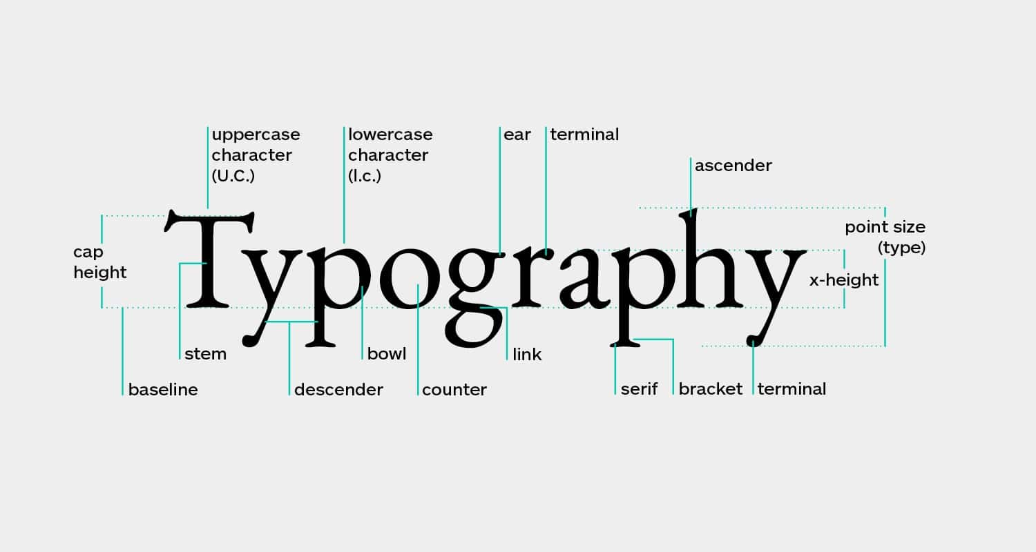
In order to decide on a suitable font, you should know a few characteristics of typography. Basically, you can say that paragraphs should consist of fonts that are easy to read. If it becomes too strenuous, the visitor will stop reading your page. The information you present will not be consumed.
Another aspect here is to pay attention to how the font changes when it is reduced in size. This is because a font that is easy to read on the desktop may be difficult to read in a smaller format on a mobile phone.
There are indicators that you can look out for to help you choose the right font.
x-height
In the following example, you can see three different examples. The x-height describes the vertical height of the letter x. If this is too small, the text becomes more difficult to access, especially with smaller font sizes. If the x-height is too large, it becomes more difficult to distinguish between upper and lower case letters.

Web Typography
Apertures
Apertures are the openings that we find in letters. Generally speaking, the more generous these are, the more pleasant it is to read long sections of text in this font.
Letter spacing and kerning
While letter spacing describes the general distance between letters, we understand kerning as the distance between certain letters. This spacing can be greater than between others due to the natural shape of the letters:
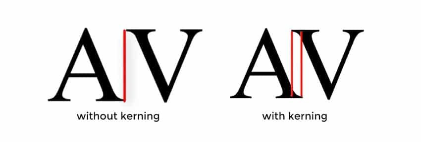
Even spacing makes your font look more harmonious. This makes it easier to read. Both can also be adjusted using CSS if you feel that the font you have chosen still needs some improvement:
.kerning {font-kerning: normal;}
.spacing {letter-spacing: 0.1em;}
Terminals, Ascenders and Descenders
Terminals occur in the letters a, ä, c, f, j, r and y:

Web Typography
Ascenders and descenders are similar, but refer to the extensions at f, q and j, for example:

Web Typography
The following applies to them: the more inconspicuous they are, the less suitable they are for use with pronounced texts. Terminals, ascenders and descenders are particularly pronounced in serif fonts, which is why these fonts were long regarded as a safe compromise for longer sections of text.
Contrast
Fonts with high contrast (left) are less suitable for small font sizes, such as those used in paragraphs, and are better suited for headings.

Web Typography
Bold and Italic
When choosing your fonts, you should also make sure that they are available in different weights and styles. This is because non-existent font styles may be falsified by the browser and can then look like this:
(In each case, the font style “faked” by the browser is shown on the right)


Web Typography
Based on these criteria, you can now search for the body font for your website. Since the choice of these is usually more complicated and there is more to consider here, I recommend starting with this and choosing the heading font(s) based on the body font (and not the other way round).
Upselling, cross-selling & measuring success
Discover how to effectively measure and boost cross-selling opportunities with actionable strategies tailored for agencies and freelancers on the Raidboxes blog.
You can find a more comprehensive overview and further explanations of terms here: https://www.shillingtoneducation.com/blog/what-is-typography/.
Serif, Sans Serif and Monospace
There is a wide range of categories for fonts. The three most common are probably
- Serif, for example Times New Roman
- Sans Serif, for example Arial
- Monospace, for example source code
There are two simple procedures you can follow for font combinations. These are not a must, but merely guidelines that can help you. Especially if you don’t have much experience in combining fonts:
- Use the same font for the body and headings – but change the weight, letter spacing and size, for example Lato:

- Combine a serif and a sans serif font, for example Baskerville and Open Sans:
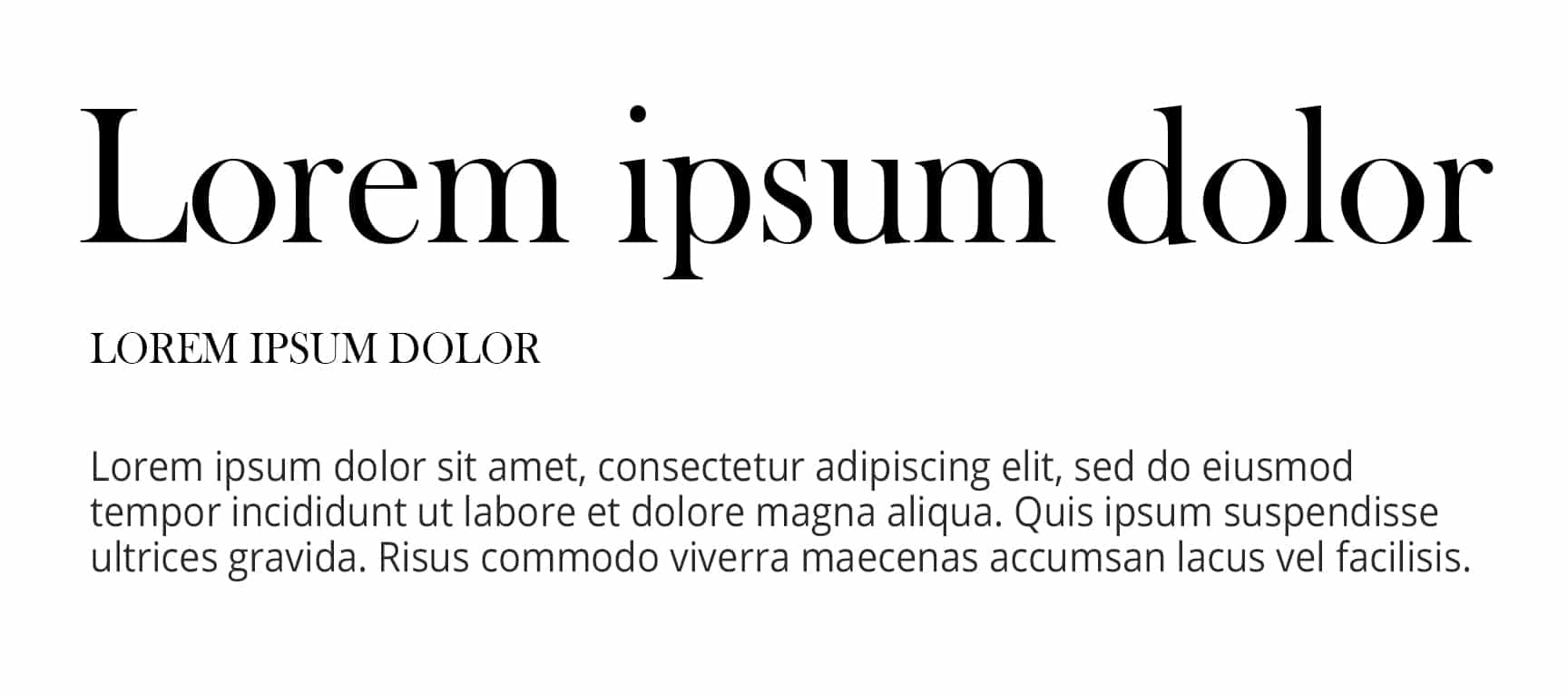
There is also an online tool that you can use to quickly discover and try out different font combinations: https://fontjoy.com/#.
Conclusion on typography on the web
Another important topic that I have completely ignored is the use of colours. Depending on whether your font is on a light or dark background, it will of course look different. You can also create font variations by using the same font and not only displaying it in different weights, but also in different colours. When choosing the colour, you should not disregard the style guide and the branding of your brand.
In addition to analysing other websites, it is also a good idea to look at current trends for inspiration. You will quickly realise that certain font pairings are always repeated here and that there is little that is new. Depending on the project and requirements, however, it may be necessary to fall back on the familiar rather than being particularly innovative – you can find more details in this article.
Further resources on the topic
- More on the subject of colour theory: https://rb001.dev.360vier.net/blog/webdesign-development/web-design-principles/
- All about professional web typography: https://prowebtype.com/
- Variable fonts for responsive design: https://alistapart.com/blog/post/variable-fonts-for-responsive-design/
Your questions about the perfect font
What questions do you have about typography on the web? Feel free to use the comment function. For more insights on WordPress, web design or online business, follow Raidboxes on Facebook or LinkedIn – or subscribe to our newsletter.

Leave a Reply