
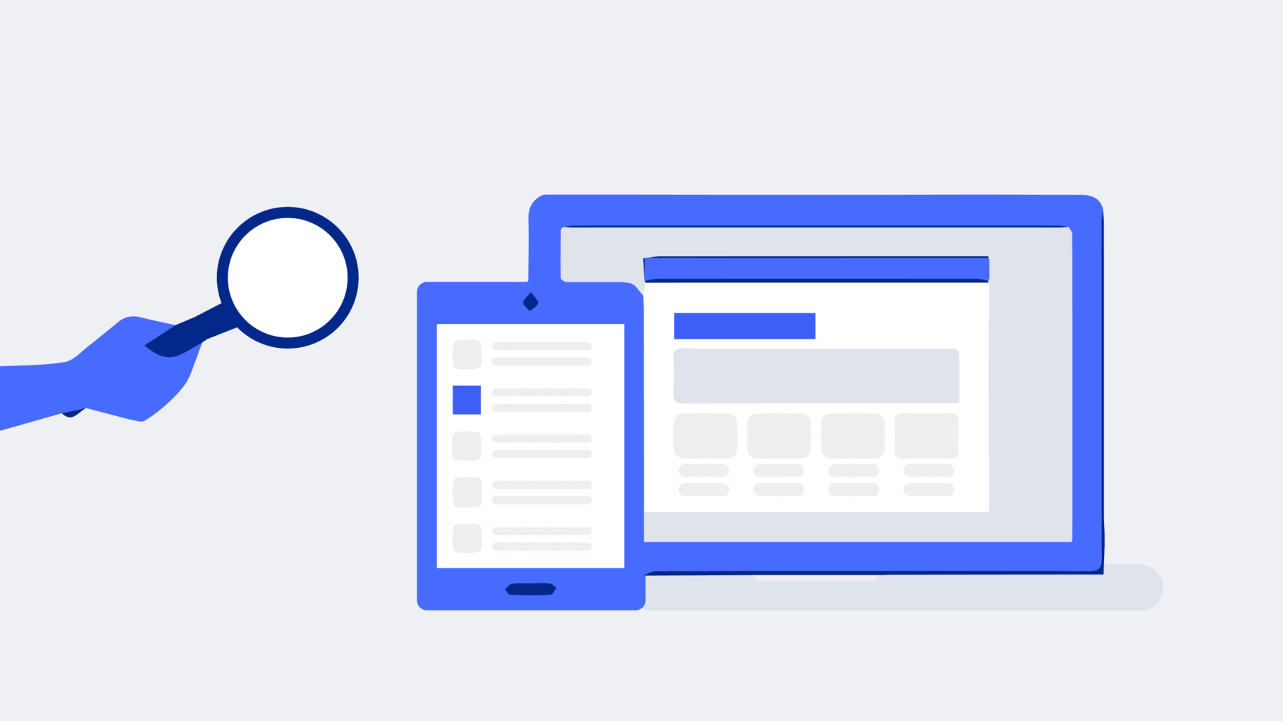
Google adverts are a tried and tested means of attracting new customers. And to sell even more online. But what should the landing page behind it look like so that the campaign is actually successful? And so that you don’t waste money?
It’s no wonder that Google adverts and AdWords are so popular. After all, you can reach your potential target group whenever they are looking for your products or services. However, simply selecting the right keywords and optimising your ad for them is rarely enough. Rather, the user experience with the target page is no less important.
What’s the point of a click if someone has barely arrived on the advertiser’s website and then bounces again? Exactly! Nothing, niente, nada! Just costs for the advertiser, frustration for the searcher and a negative reflection on Google (“The search results were better before …”). This is precisely why Google uses the “user experience with the landing page” as one of three components to determine the quality factor. And the quality factor – you guessed it – decides, alongside the bid, in which position your advert is displayed.
Content marketing for advanced users: The 6 most important levers
Discover how to optimize your content marketing to reach the right audience, build trust, and achieve long-term success.
So what to do? You can either adapt the existing landing page – although this may also have (negative) consequences for findability in unpaid Google searches (keyword: SEO). Or you can create customised landing pages specifically for your campaigns on Google and Microsoft Ads (also known as SEA; SEA stands for Search Engine Advertising).
SEA Landingpages and SEO
Important from an SEO perspective: Please set your SEA landing page to “noindex” if you also have a “regular” page on this topic. Otherwise, you will create a duplicate, which Google doesn’t like at all.
Whether and to what extent SEA landing pages are worthwhile depends above all on how much budget you allocate to your SEA campaigns each month. Of course, it takes a lot of time (in-house) and / or money (agency) to conceptualise, design and technically implement suitable landing pages.
Of course, this investment should be amortised as quickly as possible. And to achieve this, it is necessary that the conversion rate of a significant (!) number of buyers or prospective buyers (conversion rate) increases significantly thanks to the landing page. So let’s take a closer look at the six points that make up a really good landing page.
Relevance
A functioning SEA landing page picks up on the promise of the SEA advert and the intention of the searcher both in terms of content and design (particularly important for campaigns in the Google Display Network). Potential customers will find exactly what they are looking for.
In psychology, this is referred to as conforming to expectations. And this is best achieved with a continuous, consistent dialogue path. Both the advert and the landing page should therefore be unmistakably consistent in terms of content and design (for display ads).
The key question for users is: “What is it about and what do I get out of it?”. The concrete (!) value proposition is therefore of fundamental importance:
- Place the search term directly in the headline
- Convince potential customers with simple words and short sentences why it is worth requesting the whitepaper or securing a free initial consultation
- Show which challenges can be solved in no time at all
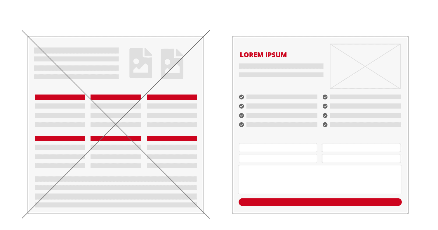
Important here: Keep the “noise” on the landing to a minimum. This means: No distractions! No overload of information. Instead, a clear focus on what you are looking for, a strong emotionalisation of the topic (“Emotions make the money”) and a (!) clear call to action.
Attractive design
Do you know the halo effect? “Halo” originally comes from the Greek and is the term for a halo of light. It refers to the radiating effect of a dominant feature. People tend to infer unknown features (your expertise as a consultant) from known features (the layout and visual appeal of your landing page).
As the saying goes, there is no second chance to make a first impression. It usually only takes a few seconds to form an initial opinion about the website. The visual impression of your landing page is particularly important for this. Does the design look appealing and professional? Or is it rather amateurish and endeavoured?
Managed WordPress Hosting
With our Managed WordPress hosting, you get a powerful, secure and easy-to-manage solution that quickly and reliably takes your WordPress project to the next level. Check it out!
The same applies to the atmospheric images used. Make sure that they look authentic and suit your company. Illustrations drawn specifically for the respective product or service have proven to be a good alternative. They look very valuable and illustrate the message of the landing page. Last but not least: Give the elements and your text enough white space to “breathe”. Otherwise the page will quickly appear overloaded.
Build trust
When someone clicks on your Google adverts for the first time, he or she usually doesn’t know your company yet – or at best only by hearsay. This makes it all the more important to build trust as quickly as possible. Otherwise, you run the risk that the visitors, who have often spent a lot of money on SEA adverts, will bounce straight away. One of the most important questions visitors ask is: “Who have I landed on here?”.
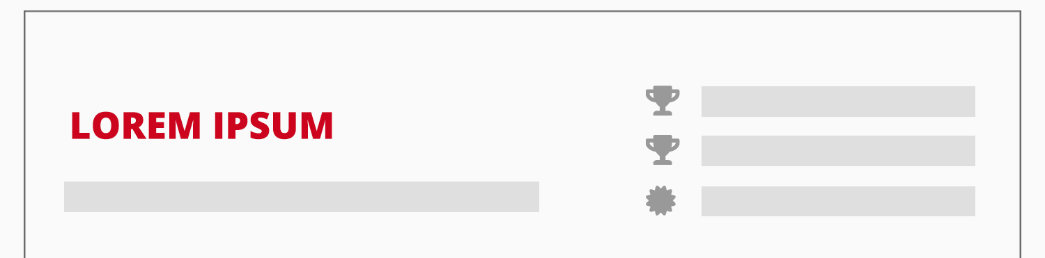
Always place your company’s logo in the header so that your visitors can immediately see whose site they are on. Use (reputable and presumably familiar to the target group) seals of approval and awards. Point out the number of projects you have already realised to underline your seriousness and professionalism.
Show visitors that they are in good company. For example, by displaying the logos of satisfied customers or letting satisfied customers have their say.
Compact presentation
The following applies to landing pages with regard to content elements (including text): As much as necessary, as little as possible. A short introduction may make sense from case to case. A short (!) explanation of the product or consulting service will also be necessary for understanding in many cases. Nevertheless, you should always get to the point quickly.
This is where there is a decisive difference to conventional product and offer pages. In contrast to “regular” pages, you don’t have to take search engine optimisation (SEO) into account with SEA landing pages. After all, you don’t want the pages to rank in Google search results, but rather use them specifically for advertising campaigns.
User-friendliness: Lead directly to the action
The golden rule of user-friendliness “Don’t make me think!” applies. This landing page should be as expectation-compliant as it is self-explanatory and lead directly to the desired action. The rule here is: the fewer clicks required, the better. Possible goals are
- Download a white paper or e-book
- Enquiry for a free consultation
- Conclusion of an e-mail subscription
Tip: Scarcity and time limits have an effect. Goods that are only available for a limited time are particularly appealing to us. For example, you can advertise that a study is only available to download free of charge for 14 days (e.g. because your company is celebrating its 5th anniversary) and is then available at the regular price of e.g. €25.
Show transparency
Show visitors what the next steps are once they have sent you a contact enquiry or requested a white paper from you. For example: “We will reply within one working day”.
Offer visitors several opportunities to get in touch with you. Experience shows: Not everyone likes to use a contact form. Some prefer to write an email. Others prefer to pick up the phone straight away. Here’s a bonus tip from me:
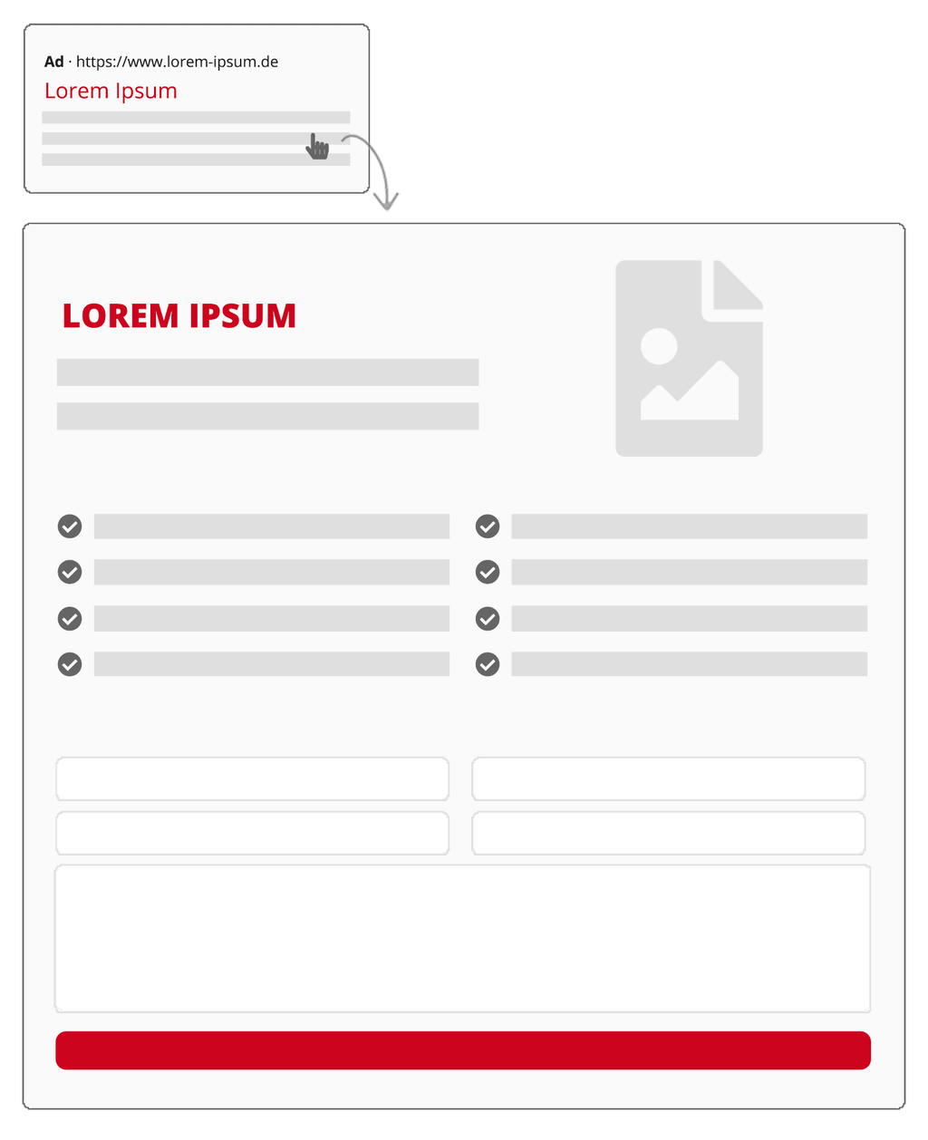
Proven elements of a B2B landing page
- The header: company logo and low-threshold contact options (telephone, e-mail, live chat…).
- The stage: A prominent headline, a button (e.g. as a jump to the form to request a free initial consultation; alternative: A contact form opens in a layer), a high-quality illustration on the topic and trust elements (seals, awards, etc.).
- Customer logos: More compact in one line to click on.
- x good reasons: A short and crisp explanation of why people should choose you and your solution.
- Frequently asked questions (optional)
- Quotes from customers (optional)
- Contact form: Keep as few fields as possible. Make it as easy as possible for interested parties to get in touch with you.
- Next steps: For example, “You will receive a personalised response from our advisors within one working day.”.
My conclusion
In this article, you have learnt about the six success factors for creating effective landing pages for Google ads. Of course, these rules are not set in stone. It always depends on what makes your target group tick. It can therefore make sense to let two variants of the landing page compete against each other in an A/B test.
Your questions about Google Ads & Landing Pages
What questions do you have for Jürgen? We look forward to your comment. For more insights on WordPress, web design or online business, follow Raidboxes on Facebook or LinkedIn – or subscribe to our newsletter.
Leave a Reply