

If you want to optimise WordPress, some measures are crystal clear, well-known and proven to be effective. However, even supposedly thoroughly optimised websites often still have potential. That’s why it’s worth looking beyond Google PageSpeed Insights and the like. After all, many performance tools provide veritable data goldmines that enable very comprehensive analyses – if you know what to look for.
Simple performance tools such as Google’s Test My Site or Google PageSpeed Insights mainly produce a list of recommended actions. This may be fine to start with. However, if you want to monitor your WordPress projects efficiently and optimise WordPress in a meaningful way, you should sooner or later use a performance tool that also displays the loading time of your website and shows you exactly how your blog, shop or company website behaves when loading.
These include Pingdom, GTMetrix or Webpagetest, for example. These often provide a so-called waterfall chart. These somewhat unwieldy data sets are hardly noticed by many. However, if you work professionally with WordPress, you should understand how they work. Because: There is no other data source that shows you how quickly your website loads, how good your web host is, how efficiently your website loads and where the construction sites of your website are located.
And with a little practice, you can analyse any website at a glance and in (hand-stopped) 7 seconds 😉 How does that work? I’ll show you step by step today!
Managed WordPress Hosting
With our Managed WordPress hosting, you get a powerful, secure and easy-to-manage solution that quickly and reliably takes your WordPress project to the next level. Check it out!
Optimise WordPress: Without a waterfall chart, you’re just scratching the surface
Maybe you’re asking yourself now: Why all the effort? There are great performance tools that already show me all the important optimisation measures. What’s more, it’s usually limited to the following points anyway:
- Caching: Either server-side or via plugin
- Image optimisation: See our plugin comparison, for example.
- Compress and summarise CSS and JavaScript
- Hosting
- CDN
Of course, if you have clarified and optimised these points, you have created a very good basis for a really fast website. That’s why these reasons are (quite rightly) covered in all good performance guides.
For example
- The comprehensive WordPress performance guide from Hootproof
- From Trabbi to Porsche – 7 tricks to make WordPress faster by WP-Ninjas
- 13 measures on how to make WordPress fit for high loads – from our former Head of Product Matthias.
And these reasons are also always at the top of the list of the most common WordPress website load time slowdowns.
However, our experience from hundreds of systematic performance analyses with webpage tests and extensive site checks shows that even in supposedly “thoroughly optimised” WordPress websites, there are always performance pitfalls. And this is exactly where the waterfall diagram can help. Because it can do something special: it shows you how your website loads, which elements are loaded and how quickly the whole thing takes place.
How to access the treasure trove of data
All good performance analyses also output waterfall charts. If you use the Pingdom tools, for example, you only have to scroll down far enough.
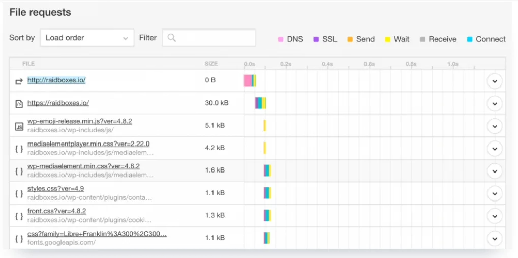
With the Pingdom tools, you first have to scroll a little to reach the waterfall diagram. The corresponding section is called File Requests. Webpagetest and GT-Metrix each have their own tabs for the diagrams. However, in order to be able to capture all this information correctly, you need to understand how to read waterfall charts correctly.
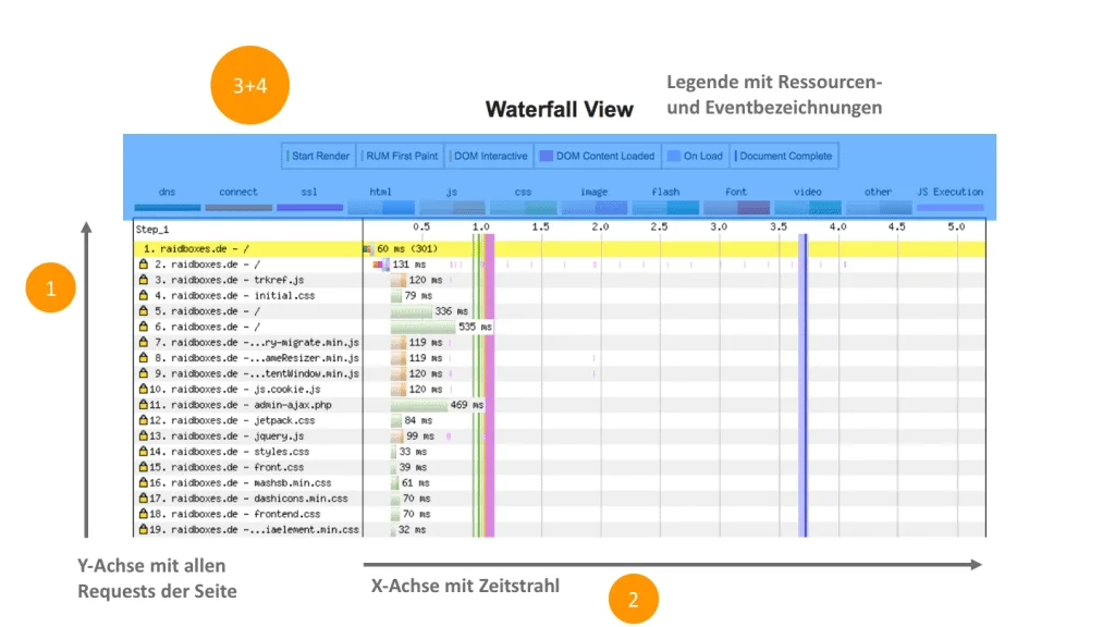
How to read waterfall diagrams correctly
The concentrated density of information means that waterfall charts are not exactly known for their clarity. In fact, you only need to know four things to understand the data sets:
- Time is plotted on the X axis. Waterfall diagrams are structured chronologically: Using the X axis, you can see exactly when an element starts to load and how long it takes to do so. It is precisely this chronological structure that makes a waterfall chart so valuable. It allows you to see exactly where loading time is being lost and which processes you need to focus on in order to optimise your loading speed.
- Every HTTP request is recorded on the Y axis. In most waterfall diagrams, you can click on the elements on the Y axis to obtain additional information about them.
- A legend shows which type of resource is being loaded. Webpagetest marks HTML, CSS, images, Flash etc. in colour, Pingdom uses symbols for this.
- An additional coding system provides information on how individual requests are executed – for example, how long it takes to connect to the server or whether HTTPS is used.
The following illustration shows the four areas just described.
Optimise WordPress with the 7-second analysis
So now you know how to read a waterfall chart – but what insights can you draw from it?
The 7-second analysis has proven its worth for us when analysing performance: The diagram gives you information about seven important factors for loading speed at a glance. These seven hacks help you to understand exactly how and how fast your website is rendering. And they show where there is potential to make it faster, fix problems or improve it further.
Note
In our examples, we will always refer to the waterfall diagrams from Webpagetest, as we actually always use this tool, whether manually or automatically.
Tip #1: Size matters
The longer the waterfall is (i.e. the more elements are removed on the Y axis), the more requests have to be processed and the slower the website loads. Nevertheless, a long waterfall does not necessarily have to be bad. There are features and external resources that you simply can’t or don’t want to do without. Our live chat, for example, is one such tool. Loading the chat programme naturally slows down our website. However, fast support via chat is a central component of our hosting. So we can’t do without the plugin.
HTTP/2 also ensures that the sheer number of requests is no longer as important as it was a few years ago.
This is because with the new web standard, requests can be processed simultaneously instead of one after the other as before. In addition, the server under HTTP/2 already sends HTML files to the browser as a precaution. The new standard therefore compensates for any disadvantages that may arise from a large number of HTTP requests. However, in order to benefit from HTTP/2, your website must be loaded via HTTPS, i.e. have an SSL certificate.
In any case, our experience has shown that there is no direct correlation between the length of a waterfall and the actual loading speed. At least up to a certain limit: with significantly more than 100 requests, there is definitely potential for savings in most cases.
If your website exceeds this threshold, you should take a closer look at your HTTP requests. For example, our homepage loads with over 130 HTTP requests. So there is potential for optimisation here. If your waterfall contains more than 100 requests, take a close look at which of them you can do without.
Tip #2: Recognise loading time
The maximum value on your X axis is essential for analysing the loading speed: Here you can see how much time elapses until your website is completely rendered. The smaller this value is, the better.
If the maximum value of your X axis is above 10, you should definitely look at the loading speed of your website. The total loading time of your website should be less than 10 seconds.
Subscribe to the Raidboxes newsletter!
We share the latest WordPress insights, business tips, and more with you once a month.
"*" indicates required fields
Tip #3: Recognise perceived loading time
Most users don’t really care what values analysis tools spit out. The only thing that counts for them is how quickly they feel the website loads.
If you operate a website, it is therefore important to improve this feeling of speed as much as possible. You can achieve this through optimal caching, above-the-fold optimisation or – if your customers are based abroad – the use of a content delivery network (CDN).
Fortunately, you can also get to the bottom of this perceived loading time using waterfall charts. As far as we know, Webpagetest is the only free tool that differentiates between the technically measured loading time and the loading time perceived by the user.
The entire diagram shows the – less important – technical loading time. The perceived loading time is hidden between the blue and green lines in the diagram.
The green line indicates when the first visual element of the website is loaded (this is referred to as the “start render” point). The blue line indicates when the user perceives the website as fully loaded – from this point onwards, the likelihood that they will interact with the website increases significantly. These two lines should be as far to the left and as close together as possible.
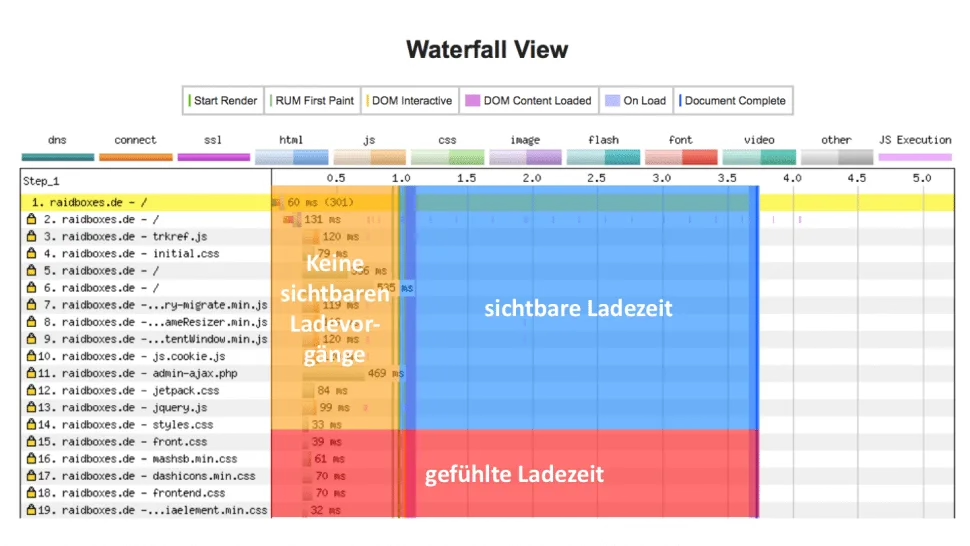
The orange area shows the phase in which no visible content is rendered. Until the end of this phase, the visitor only sees a white page. The blue area marks the time span between Start Render and Load Time, during which the visitor can perceive a visible rendering process (e.g. an hourglass). Both together form the perceived loading time.
Webpagetest is the only tool that provides you with this data. We are not aware of this with Pingdom Tools or GTMetrix. This rule therefore only applies if you use Webpagetest: The green line should appear after around 2 to 3 seconds, the blue line after 7 seconds at the latest.
Tip #4: HTTP/2 vs. HTTP/1
HTTP/2 offers a decisive advantage over HTTP/1: websites load much faster with the newer web standard. However, in addition to an SSL certificate, you are also dependent on your host providing you with this service. However, many people are unsure whether this is actually the case for them or not.
One of the biggest advantages of HTTP/2 is the simultaneous processing of multiple requests. And this is exactly what you can clearly see in your waterfall diagram. As the requests are processed chronologically, several bars start at the same point on the X axis when HTTP/2 is used.
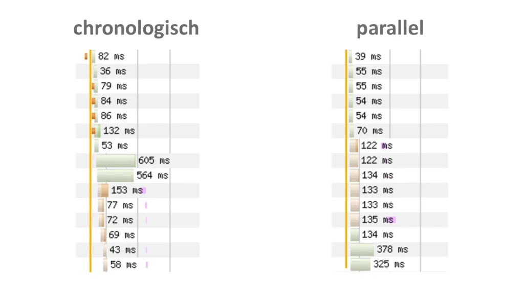
On the left you can see the typical loading behaviour of a WordPress website without HTTP/2. The individual HTTP requests are executed one after the other. On the right, you can see how the same website behaves with HTTP/2: The individual requests are loaded simultaneously.
If individual requests load in parallel, your website runs with HTTP/2.
Tip #5: Recognise images that are too large
In around 30 per cent of the websites we analyse, we still find potential in terms of image size. This is despite the fact that most webmasters assume that they have already optimised this area.
In our experience, images are – after caching – the most important factor in page load time. For every image you upload in the backend, WordPress automatically creates a whole series of additional files, the thumbnails or featured images. The correct compression of these files is one of the most effective methods of reducing the size and therefore the loading speed of your website.
For example, we can show you how to optimise your images properly:
- WPMU DEV:“How To Properly Compress And Resize Images For WordPress“
- Our comparison of 5 image optimisation plugins for WordPress
- The plugin manufacturer Optimus explains the basic differences between lossy and lossless compression
In the waterfall diagram, images can be quickly identified using the legend: Webpagetest displays them with purple bars, Pingdom with an icon. Only GTMetrix does not show images separately. In any case, if the corresponding bars are significantly longer than the bars of the other requests, this indicates a long image loading time.
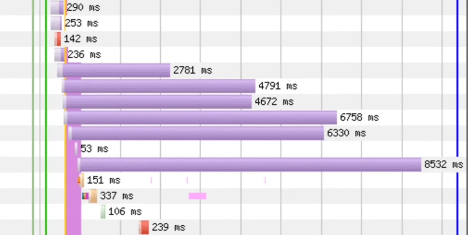
In the illustration you can see an extreme but very clear example of uncompressed images. Some of the files alone take over 8 seconds to load, slowing down the entire website.
In a case like the one above, you should take a very close look at your images. By clicking on the corresponding request, you can usually see exactly which files are involved in a waterfall diagram. This makes the search for loading time brakes much easier. Long loading bars for image resources indicate compression potential.
Tip #6: Detect redirects
A waterfall chart not only helps you to understand which elements are loaded when and how quickly, but also how many redirects have been set up and where they point to. Requests with redirects are usually highlighted in colour. The diagram also provides you with information about which redirects have been set up and where they lead.
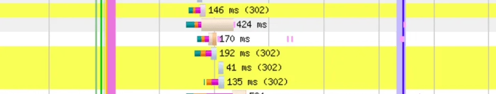
The website in this illustration has several 302 redirects in succession.
With a waterfall diagram, you can see at a glance how many and which redirects have been set. Incidentally, this also helps to detect forwarding loops after a DNS change.
Thanks to the yellow markings, we have already been able to detect unnecessary or even harmful redirects on several occasions.
Tip #7: Recognise errors at a glance
Occasionally, elements of a website are not rendered correctly. This can affect AdSense frames, for example, but also embedded maps and fonts.
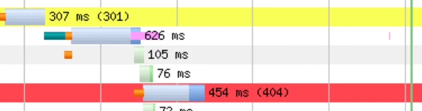
In this case, the waterfall diagram throws an error message and highlights the line with the relevant request in red. The diagram also indicates which error it is and which resource is producing the error. The website in this diagram throws an error 404.
Red lines indicate errors when rendering the website.
All tips at a glance with the cheatsheet
A waterfall chart is probably the most valuable analysis you can get for your WordPress websites. It combines various data that you should keep an eye on: Loading times, rendering order and error messages. Armed with the tips from this article, you can quickly and effectively identify where there is still potential for optimisation:
- Is the waterfall too long (over 100 requests)?
- Is the maximum value of the X axis too large (greater than 10)?
- Do requests load in parallel (via HTTP/2)?
- Are the images too large (i.e. poorly optimised)?
- Are the green and blue lines too far to the right or too far apart (i.e. does the user perceive the website as slow)?
- Are there unexpected yellow lines (redirects)?
- Are there any red lines (errors)?
Admittedly: It may take you longer to analyse this the first time. However, with a little experience, waterfall diagrams will enable you to understand your WordPress projects much better and optimise them more thoroughly.
Leave a Reply