
Colour theory and the strategies based on it provide a fundamental basis for creating harmonious designs. But what is the psychological impact of your decisions? Is it possible to address your target group even more specifically in terms of colour?
Colours play an important role in our daily lives. Especially as a creative person, colours take up a large part of your daily work. Small changes in colour can make a big difference. Colours are also important for the rest of the population: when was the last time you were “annoyed black” or “yellow with envy” because someone has the “green thumb” you would like to have?
It is not only in German that we unconsciously and regularly use associations with colours. We also find them in other languages. For example, what means to us to be drunk (to be blue) is understood in English as being melancholic/sad (to feel blue).
Cultural characteristics therefore play a not insignificant role in colour psychology. It is therefore highly recommended that you read up on the cultural significance of colours if you are designing for an international market. You can find a brief overview here.
How colors work: color psychology with positive energy
Dealing with color theory and color psychology is an absolute must as a web designer. With the choice of color, you also determine your target group. However, it is worthwhile to break with stereotypical color assignments, to question gender marketing – and to celebrate social diversity.
Statistics on purchasing behaviour
Carlfritz.net has compiled some interesting figures for us:
- More than 90 per cent of purchasing decisions are determined by visual factors. 84.7 percent of respondents are most strongly influenced by the colour of the product.
- Consumers make purchase decisions unconsciously during the first 90 seconds. The colour of the item contributes around 62-90 percent to this decision.
- Coloured ads get 40 percent more attention than colourless versions.
Subscribe to the Raidboxes newsletter!
We share the latest WordPress insights, business tips, and more with you once a month.
"*" indicates required fields
Colours and emotions
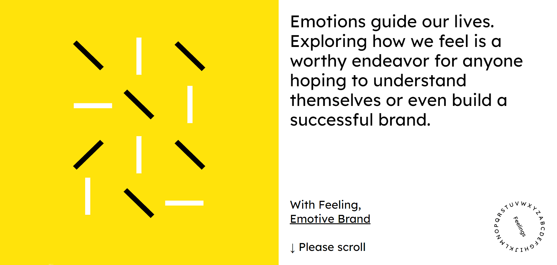
emotivefeels takes you on a fascinating and instructive journey through the different worlds of colour and the emotions associated with them.
Effect according to temperature
Warm colours have the property of having an invigorating and active effect. However, if used too dominantly or distributed inharmoniously, they can also create unrest. You can use these properties to your advantage – for example, used sparingly and deliberately as a call to action – because these colours immediately catch the eye.
However, if you use too much red and yellow in your designs, this can also lead to your actual message being lost and users being irritated.
Cold colours, on the other hand, have a calming and serious effect. Cold colours, some of which are also derived from warm colours, can have the properties of warm and cold colours. Green, for example, often has a calming yet lively effect. Pure purple tones, on the other hand, stand out and have a rather “loud” effect.
Psychological effect of colours
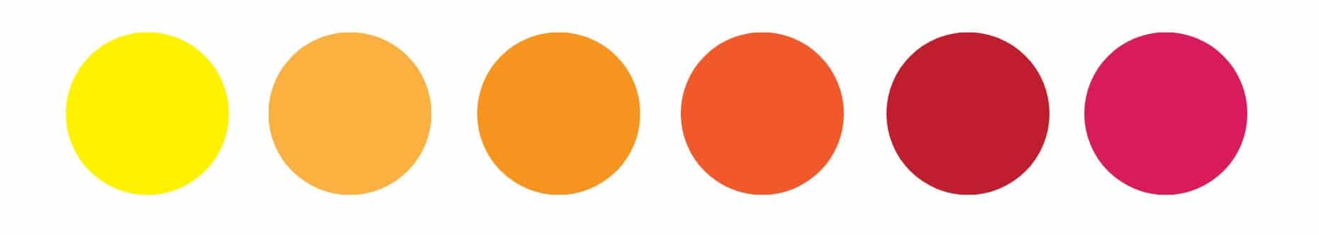
Yellow
Yellow is the colour that the human eye perceives first. Restaurants and retailers particularly like to use yellow because the colour can emphasise or intensify feelings of hunger. Yellow also stands for summer feelings and good humour. We associate it with youth, lightness, optimism and openness.
However, we also associate yellow with discounts and discount purchases. A product with this colour can therefore easily be classified as “cheap”.
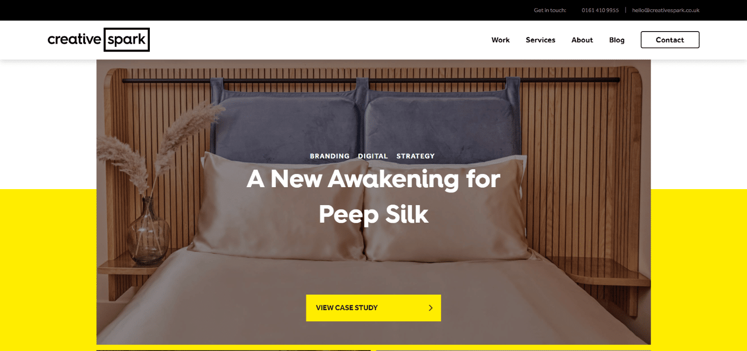
CeativeSpark use yellow on their homepage as the colour for calls to action and as a contrasting colour to the white background. Their website looks young, modern and energetic.
Red
Red attracts our attention. Red also symbolises activity and a spirit of optimism. Objects and elements in red appear closer than other objects. We have also been trained since childhood to recognise red as a signal and warning colour.
We associate red with very different characteristics. For example, it represents the colour for danger and passion in equal measure.
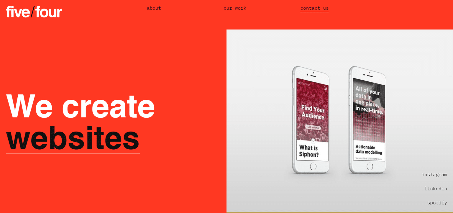
Five/Four ‘s website has a confident, energetic and authentic feel thanks to the use of red and bold typography.
Orange
Orange is intended to inspire confidence and lead to impulse purchases. We also associate orange tones with creativity, optimism and joie de vivre. Like yellow, orange also stimulates the appetite. Made up of yellow and red, it is also said to have energising properties.
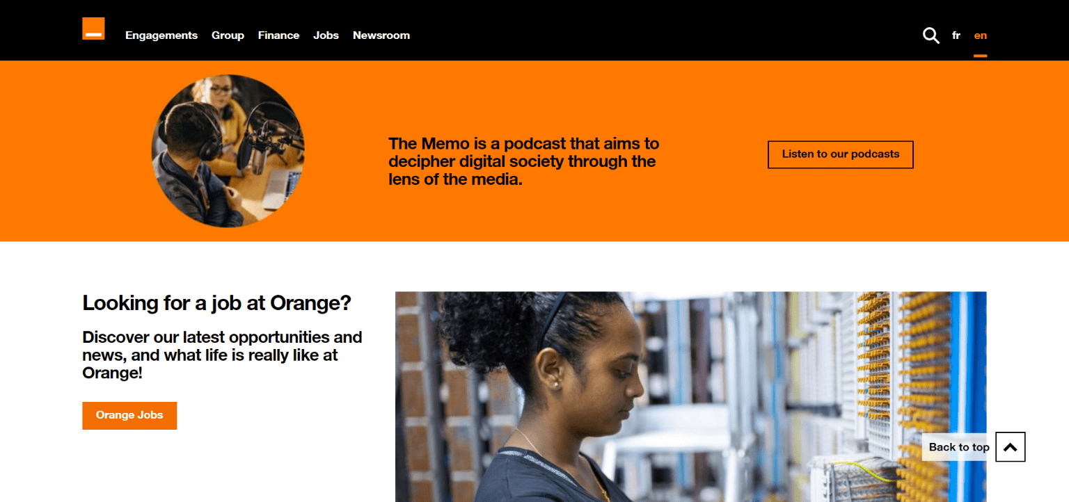
The telecommunications provider Orange has not only made orange its logo colour, but also its name. A lot of black is used as a contrast. This makes orange not only look modern, but also serious.
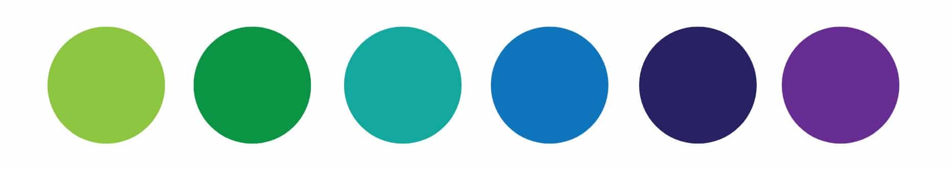
Green
Among other things, green is the colour of money. Green can increase the purchasing power of your customers. An article by Epson also reveals that green is the colour of money:
Green lies in the middle of the colour spectrum and is therefore the most balanced colour. When the world around us is green, it symbolises water and healthy plant life. In such an environment, we instinctively know that we are not in danger. We feel safe and shop with a sense of security.
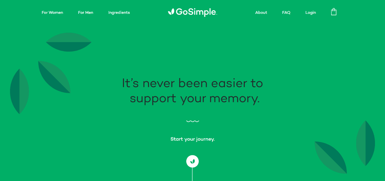
GoSimple ‘s branding has an authentic feel, as the name matches the visual design and colour scheme. While the font, logo and illustrations are minimalist, the green colour is lush and fresh, vibrant and healthy.
Planning WordPress projects: From requirements to implementation
We spoke with Ben Hutchison-Bird from NINE Brackets about key strategies for translating client needs into successful WordPress and WooCommerce projects.
The product range is also divided into those for women and those for men – a clear use of gender marketing. A further distinction was made here: a sunny, youthful yellow for women and a serious blue for men.
Blue
Blue stands for relaxation, serenity, calm, freedom, depth, loyalty and longing. This colour is rather unsuitable for the food industry, as shades of blue have an appetite-suppressing effect. Blue is statistically the colour most frequently used for logos and corporate identity. Blue is perceived as serious, honest and safe. We also associate blue with summer, the sea and travelling.
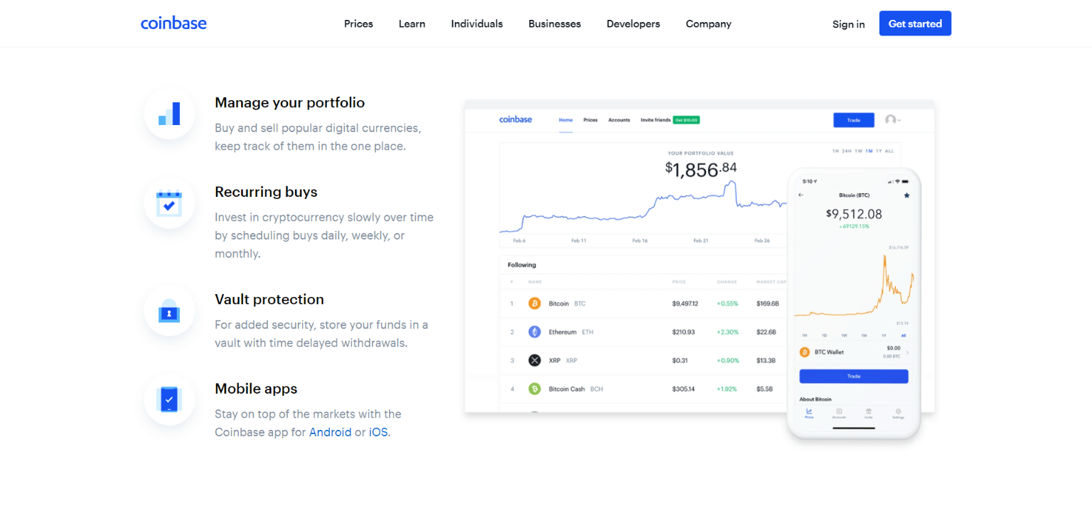
Coinbase uses a lot of white and blue as a contrasting colour. The design looks clear, tidy and serious. This makes the product appear transparent and confidence-inspiring.
Pink
The colour pink stands for gentleness, care and love. Pink is often stereotypically used for products for girls or women, for example in toys, cosmetics and pharmaceutical products. We therefore often associate this colour with femininity. Less intense than red, it still attracts attention but has a softer effect and also symbolises compassion.
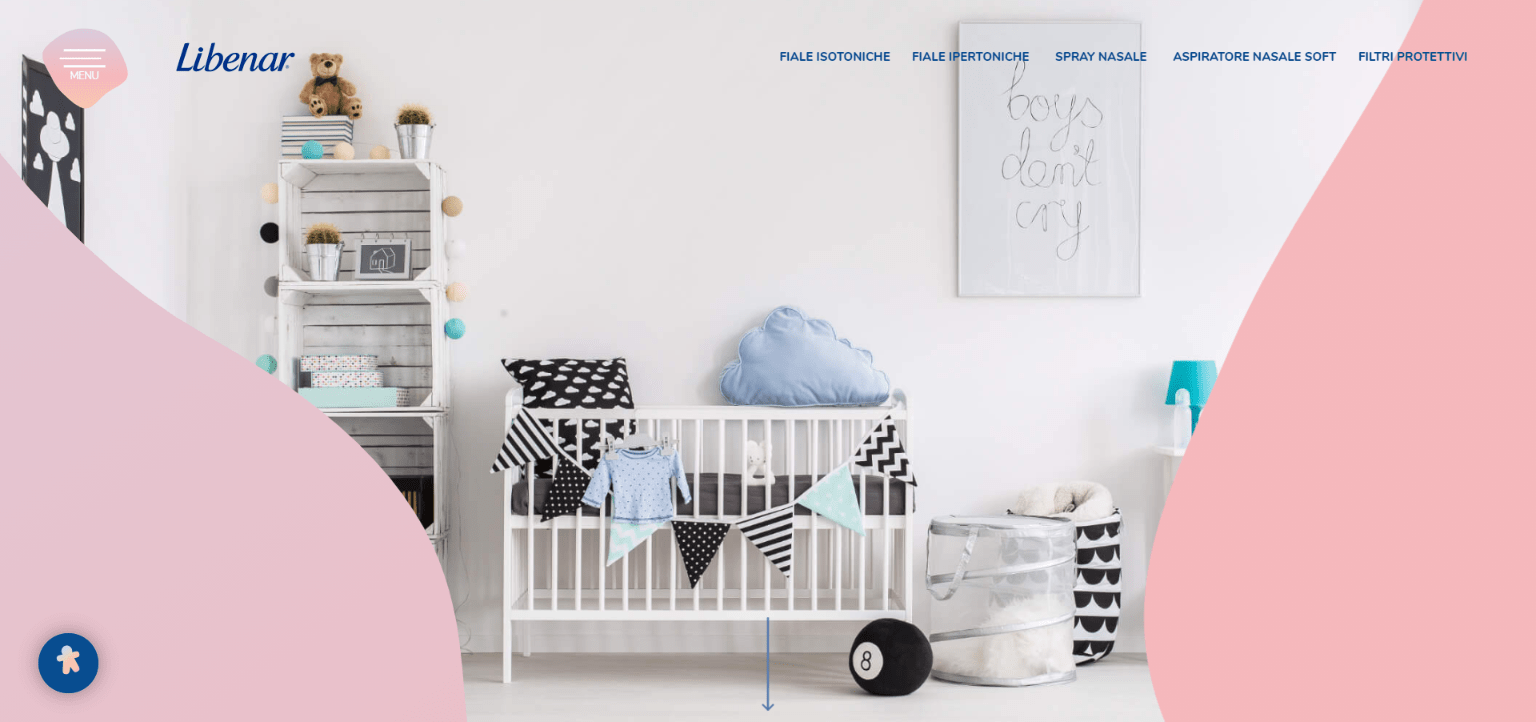
Libenar appeals specifically to parents of small children. The soft pink tones have an innocent and gentle effect.
Violet
Extravagance, exclusivity and luxury – this is what many shades of purple stand for. They are often used for cosmetic products and luxury items. We also often see purple in use in connection with spirituality.
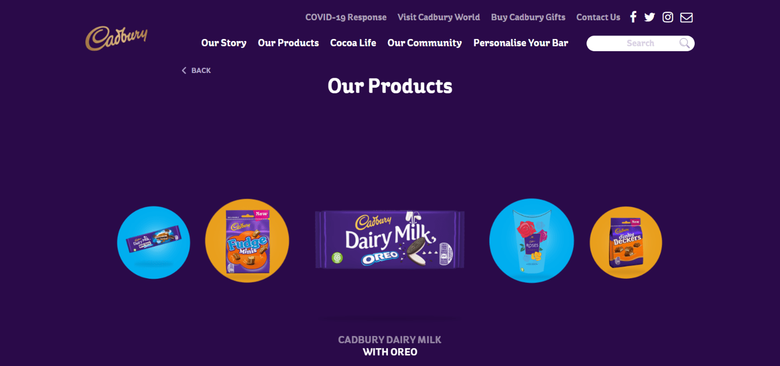
Cadbury ‘s colours stand for affordable luxury: purple combined with gold. The colour background of the products in yellow and light blue softens the luxury tone somewhat and makes the brand appear family-friendly.
Brown
Brown is a warm, natural colour. According to laprinta.de, brown is “used for coffee, outdoor clothing and wood. This is because it stands for closeness to nature as well as for safety, security and reliability. It embodies down-to-earthness and is not as intrusive as green, but somewhat friendlier than grey or black.”
Shades of brown are often used in the furnishing and food industries.
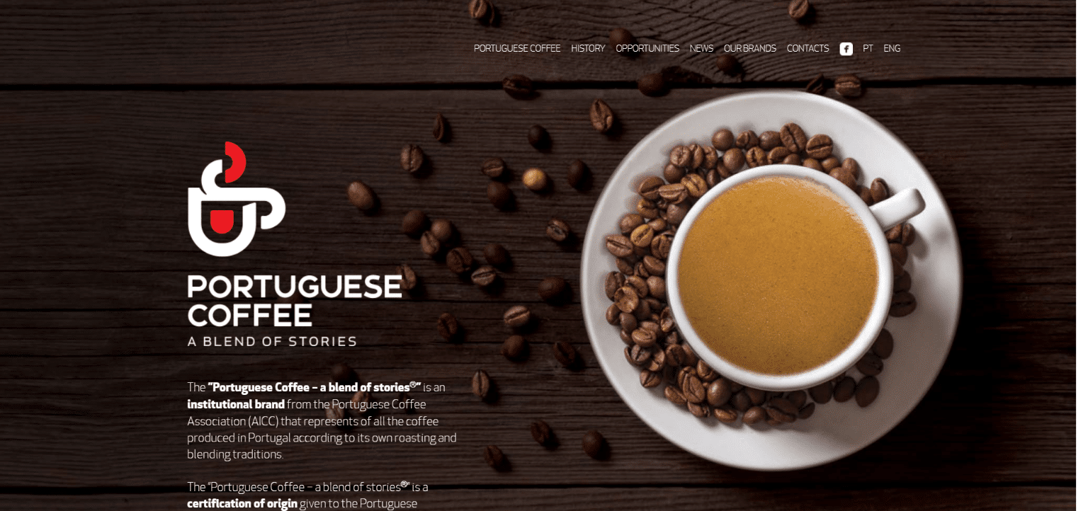
Brown is suitable for products that reflect this colour, such as coffee or chocolate, as with Portuguese Coffee. The advantage is clear, our senses are immediately engaged and we can almost smell the coffee.
Black
Black is classy, modern and functional. We associate black with luxury and elegance, with respectability, but also with mourning. Especially in combination with noble-looking colours such as silver and gold, we often find black in high-priced products.
The Verona bakery and patisserie has chosen black as its most prominent colour, even though, unlike yellow, red and orange, it does not stimulate the appetite. Despite everything, the choice was a success. Their website is mysterious, luxurious and elegant.
White
We associate purity, innocence and perfection with white. It is particularly popular in the wedding industry. White alone does not generate any emotions and takes on the attributes of the other colours.
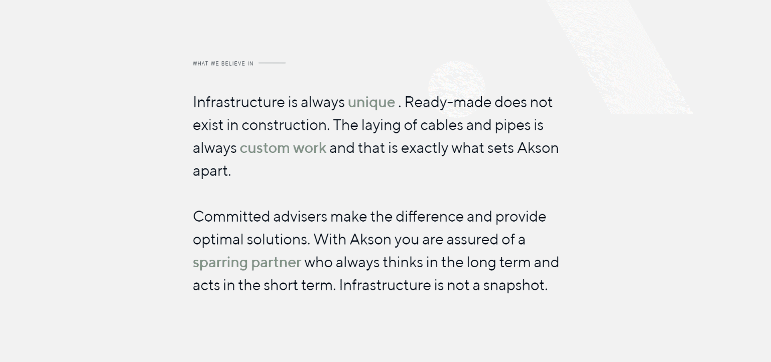
The almost white background on the Akson website also appears transparent and honest. Minimalism does not distract from the actual product, but brings it to the fore.
Grey
Grey is associated with professionalism and timelessness. Pure grey is the only colour to which no emotions can be assigned from a psychological point of view. However, this does not mean that grey has no effect on us. The absence of colour also has consequences.
On its own, grey can sometimes appear incomplete and oppressive. Together with other colours, grey often takes on their emotional effect. In web design, grey is often used in connection with seriousness and elegance. Grey appears simple and authentic and does not steal the show from the actual product. In addition, grey does not have to be mixed from pure white and black and can therefore have warm or cold attributes.
Choose the perfect colour for your business
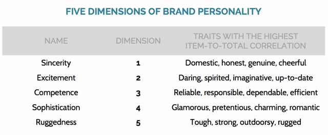
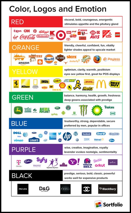
Now that you know what each colour means: How do you choose the perfect colour for your business? In their article, ConceptDrop refer to brand identity as an important approach. The focus of your brand personality is in one of these five areas, but usually covers no more than two of them.
Once you know which attributes you can find in your brand, it is easier to find the corresponding colours. Here are some examples of well-known brands and their corporate colours:
I then recommend finding out which colours other companies with similar products use. The competitor analysis gives you information about what has already proved successful – and what has not. However, using similar colour combinations out of safety is not necessarily the right approach.
It’s important to learn from what already exists, but if your customers can’t remember your brand because most of your competition is visually similar, then your product will quickly be forgotten.
Standing out from the crowd is at least as important as finding the colours that appeal most to your target group. And to find this out, you can use user testing, for example A/B testing, to check existing designs for their success.
WooCommerce Hosting
With WooCommerce hosting, you can launch your own online store quickly and securely and manage it professionally – without any technical hurdles. Check our Raidboxes WooCommerce Hosting now.
Conclusion on the topic of colour psychology
The illustrated designs also show that it’s not just the right choice of colour that is important: the general concept must be consistent. If you use confident, loud colours with a small ornate font, for example, you are sending two different messages.
In addition to the general effects that we attribute to colours, how a colour is experienced also depends heavily on the individual. Extroverted and introverted personalities, for example, are said to have different colour preferences – but this is not necessarily the case. A distinction is also often made between gender and other demographic characteristics. But ultimately, we all have our own colour associations, often unconsciously.
Perhaps the colour of your favourite blanket was yellow and that’s why a certain shade of yellow makes you nostalgic. We associate different colours and tones with different situations. While for some people the terracotta-coloured tiles in their holiday home represent the colour of summer, others may have spent most of their holidays by the local pool and therefore associate light blue with warmth and summer.
More about colours and their meaning:
- Colour charts
- Colour symbolism and meanings around the world
- How colour impacts emotions and behaviours
- 20 outstanding uses of colour in branding
Your questions about color psychology
What questions do you have about color psychology in web design? Feel free to use the comment function. For more insights on WordPress, web design or online business, follow Raidboxes on Facebook or LinkedIn – or subscribe to our newsletter.
Leave a Reply