
As the saying goes: You never get a second chance to make a first impression. You call up an unknown website and judge within a few seconds whether this site is “good” or “bad”. Especially with your own creations, it is infinitely difficult to carry out an objective analysis. Fortunately, there are tried and tested design principles that you can use as a guide. An overview.
What is good web design anyway?
Web design is quite complex: it requires more than just an eye for good typography and a feel for an appealing visual layout. Web design offers incredibly versatile opportunities for creative expression. But it also offers at least as many opportunities to get lost in the design process. Especially if you are deeply rooted in the design process, it is easy to lose sight of the forest for the trees. The result may be a design that we perceive as “bad”.
Our judgement is often intuitive, so it’s hard to explain why the same design element fits perfectly on one website but looks lost and out of place on another.
What makes a successful website?
Good websites present information clearly and efficiently so that users can intuitively find their way through the website. In most cases, a user-centred WordPress website succeeds through a well-balanced interplay of typography, interactive elements and a lot of visual polish.
And because that’s not complicated enough, we are also limited by what our potential users’ browsers can display. We may also be limited by the technical skills of the developer or the tool we use to create the WordPress website in question.
You should also take current trends and your customer’s corporate identity into account. In principle, web design is the sum of UX, UI and graphic design, the CI and current trends, taking into account the technical conditions.
Planning WordPress projects: From requirements to implementation
We spoke with Ben Hutchison-Bird from NINE Brackets about key strategies for translating client needs into successful WordPress and WooCommerce projects.
Creating a WordPress website is a pretty extensive project. No wonder there’s usually a whole team behind it. Individuals (and unfortunately also teams) often tend to focus more attention on the areas in which they are particularly strong. Whereas other areas receive less attention – or in extreme cases none at all. This creates an imbalance that could make you perceive a WordPress website as inferior in quality and inharmonious.
“Good” web design is the result of a balance between the various design areas and the technical conditions.
As a detailed examination of all areas would go beyond the scope of this article, today I will focus mainly on visual design.
Contrast, whitespace and colour
Contrast often goes hand in hand with the choice of primary colours in the design and the whitespace in the composition. However, whitespace here does not necessarily mean the space that is left white. Rather, it refers to the spaces between the elements. This space is also called “negative space” and can still be coloured.
A lot of whitespace generally makes a website appear tidier and clearer. This approach also often goes hand in hand with minimalism. This means consistently removing everything from the layout that is unnecessary and does not add any recognisable value to the design. Be it text, decorative elements or a flood of CTAs.
Especially with the trend of filling website headers with large panoramic images, we often find text overlays that are difficult to decipher.
Tip for successful contrasts
When planning contrast and color, you should also keep the following in mind: Content that is difficult to read may mean that people with visual impairments (e.g. color recognition) are no longer able to perceive this content.
A successful example of plenty of whitespace and contrast


https://aiven.io/
A weak example of contrast
Here is an example that presents a contrast problem, especially in the mobile version. The call-to-action is completely lost against the cluttered background.

Sometimes it’s not so easy for designers to filter out the right colours for a design. Fortunately, there are tools that allow us to quickly test different combinations – before we spend a lot of time creating a cost-intensive layout.
Colour theory: tools for choosing colours
Material Design Colour Tool
Material Design Color Tool creates low fidelity wireframes using two primary colours.

Adobe Colour Wheel
Adobe Color Wheel not only helps you to create different colour palettes, but also extracts the colour palettes used from existing designs. This is now also possible based on colour gradients.

When selecting suitable colours, it is worth taking a close look at the customer’s branding: Which colour palettes are already in use? To what extent can I deviate from them?
The basics of colour theory are also unavoidable: a colour with the right psychological effect can be chosen according to your customer’s industry. It is no coincidence that blue is often used in more serious sectors such as insurance, consulting and comparison websites. Blue has a confidence-inspiring and calming effect. However, it is important not to be too general here, as even nuances of the same colour can evoke very different emotions.
Do you know the 60-30-10 rule?
This is recommended as the golden rule for the use of colour palettes. The principle applied here is: the main colour makes up around 60 percent of the layout, a complementary colour comprises 30 percent and a third colour sets further highlights with 10 percent. This arrangement has a particularly balanced effect on the user.
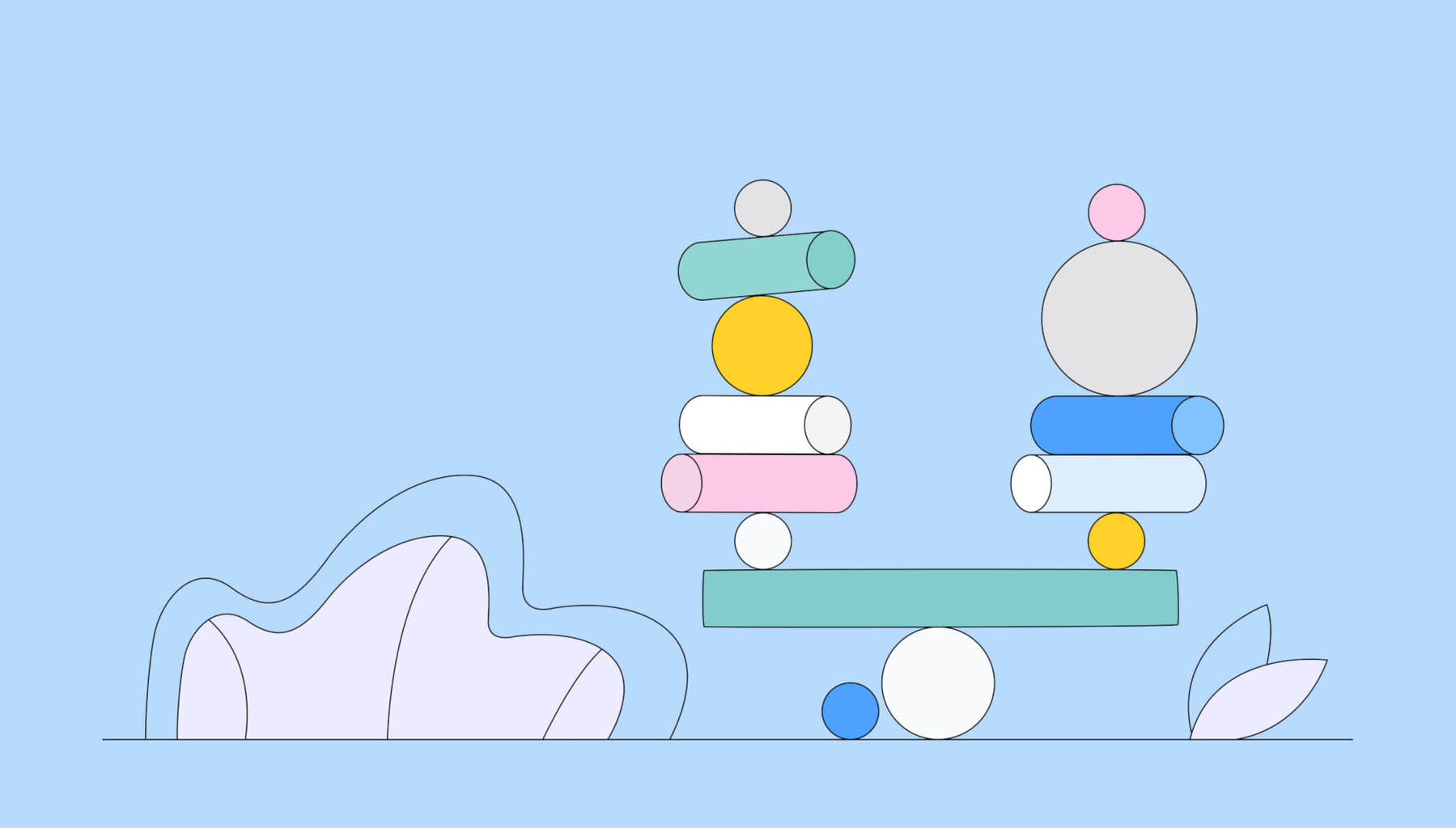
Symmetry or asymmetry?
In her article “The Principles of Design and Their Importance”, author and designer Cameron Chapman explains her two most important approaches to balance in web design. According to this, she differentiates content according to its conspicuousness – in other words, whether it is more eye-catching or less prominent.
Accordingly, the following challenge is to arrange the content in such a way that it conveys a sense of balance. The design decision “arrange symmetrically or asymmetrically” can help here.
How do both approaches work?
In the symmetrical approach, elements with a similar prominence are arranged together. With the asymmetrical approach, on the other hand, more prominent and less conspicuous content is arranged together.
For example, the layout can be kept clean. The elements are clearly separated from each other, as is the case with Couro Azul. Such content is often placed slightly off-centre to give the weaker element a little more space and create a balance.
Upselling, cross-selling & measuring success
Discover how to effectively measure and boost cross-selling opportunities with actionable strategies tailored for agencies and freelancers on the Raidboxes blog.
Zero, on the other hand, uses the same principle – but with a freer arrangement. The high use of whitespace makes this look elegant and contemporary.
This approach works very well on larger screens (from tablet size). Smaller devices such as smartphones, on the other hand, benefit from clearly separated modules arranged one below the other.
Define and set priorities
Before we start designing a WordPress website, we should clearly define the message we want to communicate. Clarity in the marketing concept often also brings clarity in the design layout.
Once the key messages have been determined, they need to be emphasised through the use of colour and/or typography.
This example shows how the two can be combined:

However, there are also many possibilities for realisation here. Because content can be highlighted not only through bold typography and colour. You can also use images – as with Jamie Oliver’s restaurant – and an interplay of different principles to bring selected content into focus.

Proportion and hierarchy
The content of a website should be presented in such a way that it makes sense in its hierarchy. You should therefore place the most important content at the top. As the importance decreases, you should work your way down. You should therefore ask yourself: What information is most important for visitors to my website? What is merely additional information?
This is also the reason why the navigation menu is at the top in most cases. Apart from being a UI pattern, it is simply one of the most important aspects of a website. After all, the menu is nothing more than an overview of the core content that you offer there. The summary of your WordPress website, so to speak.
Visual hierarchy: what is really important
Hierarchy can also be created through so-called movement. This involves organising the content of the website in such a way that the eye is guided through it. This can be achieved with the help of shapes and arrangement, for example. This portfolio is an interesting example of what something like this could look like:

The eye is guided through the screen from left to right. Point 01 clearly has the greatest hierarchy here – although all elements are the same size and initially appear to be of equal value.
Proportion also plays a role: elements of the same size, colour and shape basically give us the feeling that they belong together and have the same function. This is particularly important for interactive elements.
The example presented above illustrates that a consistent design can largely contribute to visual harmony:
- Standardised shapes are used for all images,
- all pictures harmonise in colour,
- In total, only two different fonts and font sizes are used,
- Only one colour is used for the typography and separators,
- the separators are a recurring design element – and they visually unite the image and the two headlines.
Subscribe to the Raidboxes newsletter!
We share the latest WordPress insights, business tips, and more with you once a month.
"*" indicates required fields
Conclusion: Basic principles in web design
Despite all the basic principles mentioned above, rules are there to be broken. This is the only way to create interesting, innovative design!
The approaches I have briefly presented here are of course not new. Rather, they are adaptations of scientific and/or psychological research that have been transferred to today’s communication media. I personally find it important to be familiar with these theories and methods. We often implement rules intuitively anyway because our creative eye has “learnt” to do so.
Knowledge of different design approaches also helps you to evaluate your own projects. Think of it as a checklist that you can refer to when you realise that something is not quite working visually. You often don’t have the necessary distance from your own project to assess it objectively.
The design principles outlined here are by no means exhaustive. If you would like to delve deeper into the topic, you are welcome to take a look at these articles and e-books:
- Web UI Design for the Human Eye (Colours, Space, Contrast)
- The Principles of Design and Their Importance
- How to Use Powerful Gestalt Principles in Design
Your questions about harmonious web design
What questions do you have for Sonja? Feel free to use the comment function. For more insights on WordPress, web design or online business, follow Raidboxes on Facebook or LinkedIn – or subscribe to our newsletter.
Leave a Reply