Tidying up WordPress means digital spring cleaning. This usually involves making your WordPress website faster, more secure and leaner. Old plugins and themes are deleted, the database is optimised and the WordPress website is cleared out. But you should never lose sight of the big picture. Because a spring clean is the perfect opportunity to optimise your own site concept and drive up conversions.
We’ve all been there: images from old blog posts, deactivated plugins and themes and other data rubbish vegetating in the backend. In principle, this doesn’t bother anyone in day-to-day business, but in the long run it makes your website slow and insecure.
Spring cleaning campaigns, such as those organised by Michelle from Hootproof, David from fastwp or even entire workshops on tidying up WordPress, therefore make a lot of sense. Because lean WordPress websites tend to be faster and more secure.
And such actions give you the perfect opportunity to look at the basic concept and mechanisms of your WordPress website and to scrutinise them critically. And that’s exactly what I’m advocating today: tidying up WordPress is important, but you shouldn’t lose sight of the big picture, your site concept.
Customise layout, text & prices
With layout, text and pricing design, you can increase the conversions of your WordPress websites particularly quickly. Especially if your website hasn’t just been around since yesterday, some WordPress websites may not have seen an update for a long time or are leading a rather neglected existence. A spring clean with perspective starts right here and asks, among other things:
- Does everything comply with current web design standards?
- Are there any new insights from marketing that can be implemented or tested?
- Is my WordPress website quick and easy to read and does it fulfil its intended purpose as well as it could?
Answering these questions is not that easy. That’s why today I’m going to show you three points that you can use to critically scrutinise your site concept.
Three areas are particularly interesting. And you can use all three to optimise the impact and conversions of your WordPress website:
- General reception patterns and what they mean for your layout
- Text and what choosing the right font has to do with conversions
- the presentation of prices and how you can increase your sales with two simple tricks
What reading has to do with layout
What do design, marketing and copywriting have in common? They are based on psychology. Just as what music is playing in the supermarket affects our shopping behaviour, we are subconsciously influenced by web design, layout and text.
A good layout allows us to grasp all relevant information at first glance – so browsing a WordPress website is particularly easy. A poor layout is not necessarily noticeable to us as visitors, but the website operator will notice it. For example, because nobody downloads their e-book, subscribes to their newsletter or buys their product.
Good and bad layouts are primarily differentiated by one thing: the psychology of perception. And if you know the decisive processes, you can use them to your advantage.
And because the arrangement and order of your website elements has an impact on conversions, universal reception patterns have been used for years.
Two particularly important patterns are the F-pattern and the Z-pattern.
The F-pattern – for websites with a lot of content
In studies on eye tracking and usability, in which the eye movements of test subjects are tracked while reading a WordPress website, the so-called F-pattern has been observed time and again for years. People initially focus their attention on the top left, look to the right and then let their gaze wander down one level, where the movement from left to right starts again.
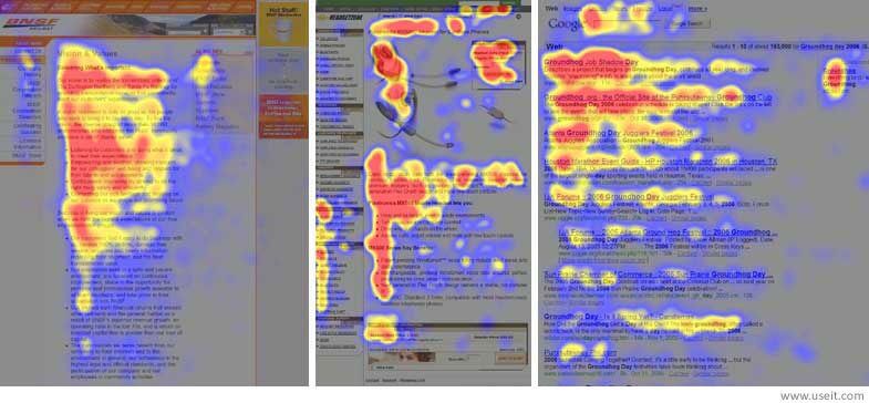
You can think of it like reading a book: you perceive each line from left to right before reading the line below. In fact, the principle is based on how people have been reading in our culture for centuries. A layout that follows this pattern is perceived as natural and comfortable. It is understood intuitively.
On the internet, the attention span is also particularly short. This is why content is scanned vertically from the top left-hand edge downwards and not read in full (hence the F and not an E with an infinite number of lines).
This means for you:
- The most important element belongs at the top left – regardless of whether this is your logo, your slogan or a countdown to the end of the discount campaign.
- Particularly relevant page elements also belong at the top of the WordPress website, for example a prominent call to action (CTA).
- In the lower part of the website, you should avoid using columns of text and instead focus on snappy headlines to attract the reader’s attention and arouse their interest when scanning.
In practice, this layout has proven itself for WordPress websites with a lot of content, for example the home pages of blogs.
The Z-pattern – important for landing pages
The assumption of the Z-pattern is that the WordPress website is flown over in a Z-shaped movement: The eye first moves horizontally from left to right at the top of the website, then moves diagonally to the bottom left and from there horizontally to the right again.
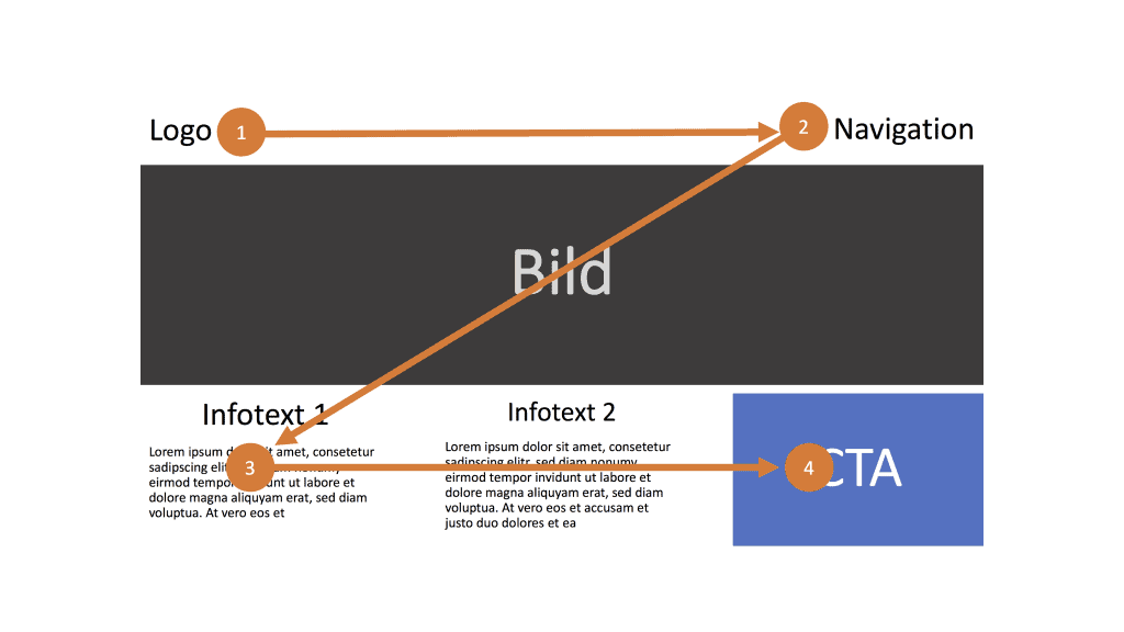
As the eye is drawn to fewer points here than with the F-pattern, this layout is generally used for minimalist WordPress websites with less content, where the CTA is the central point. It is therefore also effective for shorter landing pages.
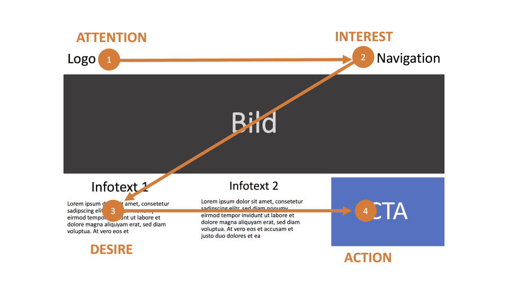
Incidentally, resourceful marketers often couple it with the well-known AIDA principle(Attention, Interest, Desire, Action):
- Attention: Attention is attracted at the first focus point.
- Interest: The second one increases the interest.
- Desire: An irresistible offer beckons on the third.
- Action: Last but not least is the CTA on the right-hand side of the page.
In the centre – where the eye wanders diagonally from point 2 to 3 – you can place large, effective images to keep attention at a high level.
F or Z: What’s the point?
Even if I haven’t just told you anything new and you already knew these principles, a critical review of your layout makes perfect sense. Taking inspiration from tried-and-tested layouts and reception patterns can have an impact on your conversions.
This is because your content is viewed favourably if it can be consumed with as little effort as possible. Familiar patterns minimise the effort for the brain considerably. This is because they correspond to the cognitive processes that are already taking place in them. And in the meantime, you direct their attention precisely to where you want it: to the call to action.
Text – everything is nothing without typography
Web design consists of 95 per cent typography
– Oliver Reichenstein, 2006
So you can imagine that it has a massive impact on your conversion rate if 95 per cent of the WordPress website is unusable. For example, because the font is difficult to read, the line spacing is too small or the text is simply too small.
What I want to say is: text is important. And typography should therefore not be neglected.
Especially if your WordPress website is text-heavy, it makes sense to critically scrutinise the typeface. Can people even read the content that you have painstakingly produced?
In addition to font size and line spacing, the question of whether fonts with or without serifs are easier to read on the screen is still regularly discussed in this context.
Typically, sans serif fonts are used on the web. This is because they are still easy to read even at low screen resolutions. This may have been important in the past. Today, however, screens are so high-resolution, especially on mobile devices, that the argument of screen-friendliness is probably invalidated.
Subscribe to the Raidboxes newsletter!
We share the latest WordPress insights, business tips, and more with you once a month.
"*" indicates required fields
The trend is towards serifs
The debate about serif fonts is also fuelled by research results. A study by Google and IBM found that participants were able to read a serif font almost 8 per cent faster than a sans serif font. This was not a statistically significant result. Nevertheless, serif fonts have a psychological effect: Years ago, an older series of studies showed that the participants felt as though they could read serif fonts faster and more effectively.
Serif fonts can therefore be read faster and better. And they tire the reader’s eye less. This also makes it easier to read longer texts. Serifs also contribute to better line formation. The eye glides through the text as if on rails. Serif fonts thus anticipate the scan-like reading mode of the online reader and simplify skimming.
Conclusion: Serif fonts are perceived positively. Web designers have also noticed this: a survey of 50 highly respected website managers – including the New York Times, the Financial Times and Zeit.de – showed that the trend is increasingly moving towards serif fonts. Over 61 per cent of the media surveyed now use serif fonts.
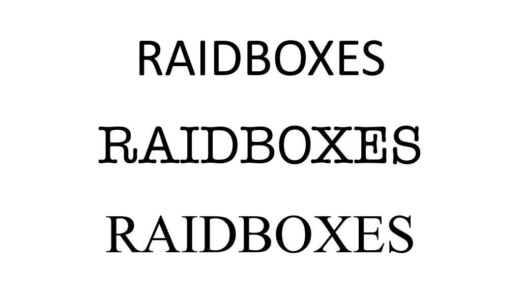
Incidentally, the combination of sans serif fonts for headlines and serif fonts for body text is becoming increasingly common. This makes the headlines stand out more when scanned.
In addition to serifs, there are other factors that influence the legibility of a website. These include white space, i.e. the total amount of empty space in a layout. In combination with generous white space, serif fonts stand out even more. The focus is then clearly on your content. And the reader’s reception is text-centred.
The psychology of prices
Changes to the layout and text are of course quite complex to implement. It is easier to take a closer look at your own price overview. Because even the smallest changes can have an enormous impact here. So when you clean up WordPress, you should definitely also analyse your price display.
From a conversion point of view, the tariff or price page is the most important page of all for most website operators – a critical look and a revision therefore make a lot of sense here.
The exciting thing is that instead of changing the prices themselves, it is worth simply changing the order of the price overview. And all because the human brain is once again looking for patterns to orientate itself by.
Power lies in the centre
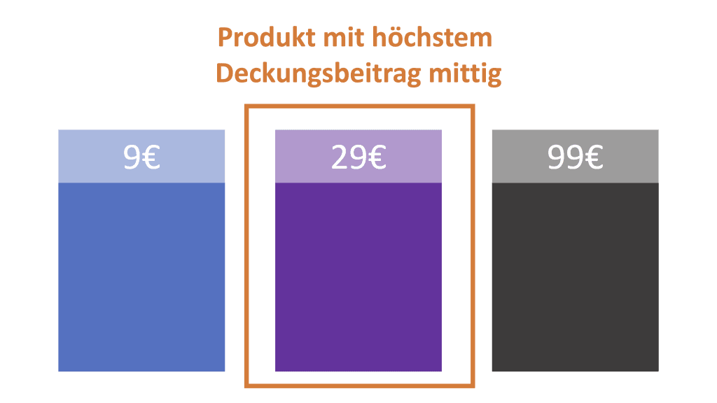
The first psychological principle that becomes important in this context is the aversion to the cheapest product – also known as the tendency towards the middle. Whether this is because people infer quality from price or because nobody wants to appear stingy, the fact is that people rarely opt for the cheapest price. Experiments have shown that out of three price options, the middle one is chosen most often. This is probably the best price-performance ratio.
The order makes the difference
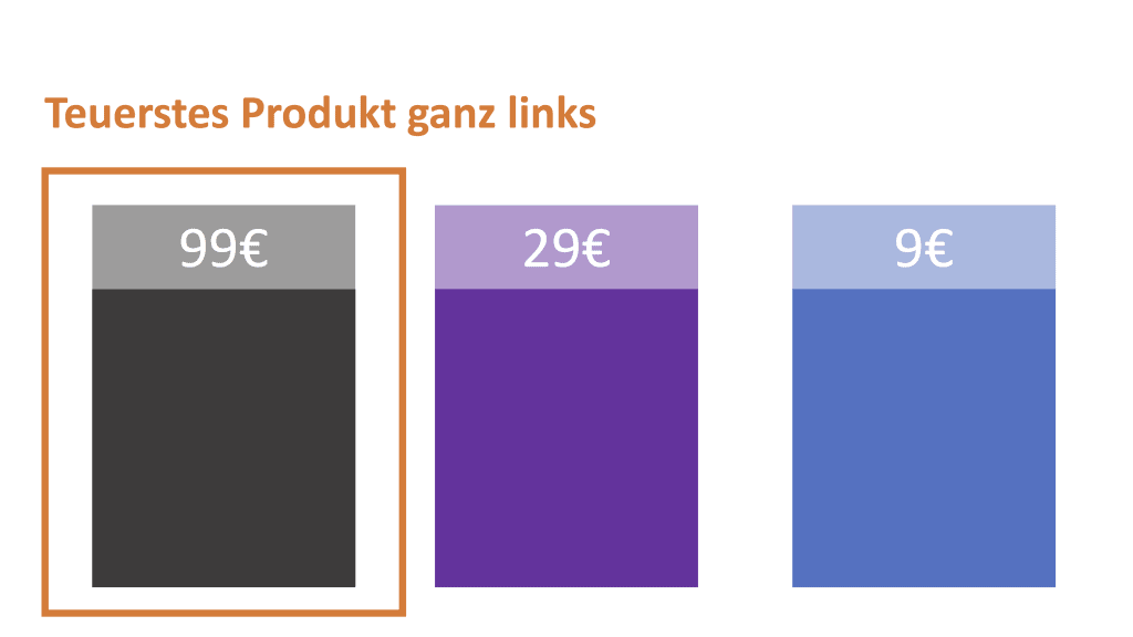
The second psychological principle that influences the perception of prices is the order. If the prices are sorted from the cheapest to the most expensive price, the entrepreneur makes slightly less turnover on average than if the highest prices are at the top of the list.
This is because the customer uses the first price they see as a reference value. All other, lower prices tend to be perceived as a good deal. If, on the other hand, the most favourable price comes first, all other prices appear disproportionately high in comparison.
People are also keen to minimise losses. With a price list that starts at the lowest price, the perceived loss is obviously financial: the more expensive the offer I ultimately buy, the more money I lose compared to the lowest price.
With a price list that starts at the highest price, on the other hand, the perceived loss is quality: the less I pay, the more likely I am to lose out on product quality compared to the most expensive product.
So if you put the highest price first, the customer’s perception changes dramatically. And you increase the likelihood that customers will opt for more expensive products. After all, who wants to voluntarily sacrifice quality 😉
So that means for you:
- Offer your customers several price options and make sure that the most profitable product is in the centre of the price table. The easiest way to do this is with an odd number of prices.
- Sort your price list from highest to lowest price
Of course, these are just two of dozens of pricing strategies. However, these two are particularly quick and easy to implement as part of a WordPress clean-up. See it as an introduction to a further examination of your pricing, as this topic has the potential to significantly influence your conversions.
Provided, of course, that you measure the results correctly.
Important: Don’t forget to measure!
I have now given you some suggestions on how you can provide your visitors with a better user experience. Whether these measures result in a higher conversion rate, however, must of course be systematically recorded and analysed.
In other words, you need to record the status quo before making the desired changes and look at your conversions again after one to three months.
Conclusion: When cleaning up WordPress, do it right
When cleaning up your WordPress website, don’t limit yourself to making the – undoubtedly important and very effective – technical optimisations. Instead, use the time to critically review your website at a conceptual level.
This way, you are sure to find one or two tweaks that you can make to boost your conversions. It is important to know the status quo and measure how the behaviour on your website changes after the optimisation measures.
And now: Happy spring cleaning!
Tidy up your questions about WordPress
What questions do you have for Jan? Feel free to use the comment function. For more insights on WordPress, web design or online business, follow Raidboxes on Facebook or LinkedIn – or subscribe to our newsletter.


Leave a Reply