
For freelancers and companies today, a convincing WordPress website is a business card, figurehead and showroom all in one. With over a billion websites worldwide and the rapid development of web design trends in 2018, it is a major challenge to stand out from the competition. Our old WordPress website could no longer do this – so we gave it a makeover. I’ll show you what came out of it and which web design trends we used as a guide for 2018.
The “dos and don’ts” in web design are developing so quickly that you would have to redesign your WordPress website every one to two years in order not to lag behind and keep up with the web design trends of 2018. A look at the web design trends of the nineties makes it clear that there is a world of difference between then and now.
Of course, it doesn’t always have to be a completely new design concept. This is particularly unnecessary for established brands and could even confuse customers. Small adjustments are often enough to improve the user experience of your visitors.
However, if you don’t think about design trends at all, you will scare away potential customers. Because, as in real life, first impressions count.
If you present yourself with a dusty WordPress website, you can’t expect to be perceived as professional, competent or innovative.
At some point, we realised that the Raidboxes design needed a makeover. What was still a modern WordPress website with a start-up feel in 2015 was no longer living up to our motto “Be free and wild and creative”. So we needed a new design! Today I’ll show you the four major web design trends for 2018 that we have implemented.
Subscribe to the Raidboxes newsletter!
We share the latest WordPress insights, business tips, and more with you once a month.
"*" indicates required fields
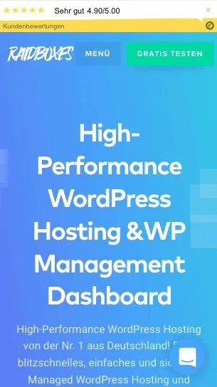
Create depth with Flat 2.0
Flat design has been a big trend in recent years. This generally refers to a very minimalist style that dispenses with large shadows, texture and 3D effects. Currently, the trend is moving back in the direction of drop shadows, but only to create targeted accents with visual depth.
As the image above shows, we have used a simple flat design to create the graphic. However, this is supplemented by drop shadows around the higher-level graphic elements. As we primarily use the shadows to emphasise individual areas of the WordPress website and present them more realistically, this can also be referred to as Flat 2.0.
This development is also important from a user experience (UX) perspective, as the different depths make it easier for users to recognise important elements such as buttons and the like.
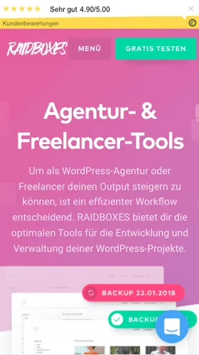
Bright colour gradients and bevels

Another big web design trend at the moment is bright colours and gaudy colour gradients. Our old WordPress website still had plain, grey backgrounds. We only set accents with blue or orange icons and buttons. The new design is much more colourful: we now use bright colour gradients in blue, purple or pink for the backgrounds.
We have also said goodbye to horizontal lines and perfect symmetry of the individual elements. In 2018, things can be a little more quirky and disorganised. For example, the boxes with the domains in the image above are arranged differently each time the WordPress website is called up. This makes the WordPress website look more dynamic overall.
These websites also use eye-catching colour gradients, slants or random elements:

Illustrations create personality
In 2018, many websites rely on cartoon-style illustrations to give their WordPress website a personal and playful touch. Unlike photos, there are no limits when creating illustrations. This allows you to create graphics that precisely reflect the identity of your brand.
Playful illustrations are entertaining, create a feeling of authenticity and offer a welcome change from artificial and old-fashioned stock photos.
In this context, the increasing popularity of the SVG format for graphics is another web design trend. The special thing about SVG graphics is that you can scale them to infinity without compromising on quality. This makes SVG graphics particularly suitable for responsive design.
Moving graphics as an eye-catcher
Another web design trend in 2018 is animated graphics. On our new WordPress website, you will find many small animations that make the user experience more interesting and set specific accents.
Large moving graphics (such as those used in our agency and freelancer tools) enable potential customers to immediately understand the subject matter of each section.
Here are some websites that also use cartoons and/or animations:
Mobile First is not just an empty phrase
It should come as no surprise that there will be an even greater focus on mobile optimisation of your WordPress website in 2018. Google recently announced once again that the ranking algorithm is to be switched to mobile-first indexing in the long term.
This means that the ranking of your WordPress website will be based primarily on the mobile version of your WordPress website in the future.
But that’s no reason to panic yet, because according to Google, the strict implementation of these plans will still take some time. However, as a good user experience has a positive effect on your ranking, you should start optimising your WordPress website early on.
Conclusion on the web design trends 2018
As in all fast-moving areas, there is no guarantee that these 2018 web design trends will actually define this new year. But no matter which way the trend develops, we are extremely proud of our new design and can identify with it all round.
What do you think of our new WordPress website? Do you know of any other design trends that you think we’ll be seeing more of in 2018? We look forward to your comments!
Your questions about the web design trends 2018
What questions do you have for Torben? Feel free to use the comment function. Do you want to be informed about new posts on WordPress and web design? Then follow us on Facebook, LinkedIn or our Newsletter.
Leave a Reply